How to Build an Inventory Dashboard in 7 Steps
An effective inventory dashboard is critical for any business that deals with physical products. This applies within manufacturing, ecommerce, traditional retail, logistics, or any other industry.
See, in any inventory management context, it’s vital that decision-makers can quickly and easily access key insights about stock levels, locations, values, supply chain data, and other key performance indicators.
That way, they can make informed decisions in real-time - without the need for manual reporting.
Today, we’re checking out why Budibase is the ideal solution for building dashboards around all kinds of existing data and complex queries, with minimal custom code.
But first, let’s think about a little bit of background.
What is an inventory dashboard?
Dashboards are essentially reporting and analytics UIs that connect to an external data source and auto-populate with the latest values for whatever information they’re set up to display.
An inventory dashboard does this for metrics related to your physical stock.
Of course, the specific KPIs and inventory metrics that you need to visualize will vary from one company to the next.
Still, we can point to a few key categories of information that you’re most likely going to want to display for effective inventory visibility
Almost all inventory dashboards will include visualizations around the current volume and value of your stock - wherever its located. We’ll typically also see projections around how these metrics might play out in the future.
This applies to individual items, product categories, and your inventory as a whole.
In more niche cases, we might also want to include data around sales, returns, shipping, breakages, or other elements of your supply chain and inventory turnover.
For visualization, dashboards can include a range of charts, tables, display cards, and other UI elements.
What are we building?
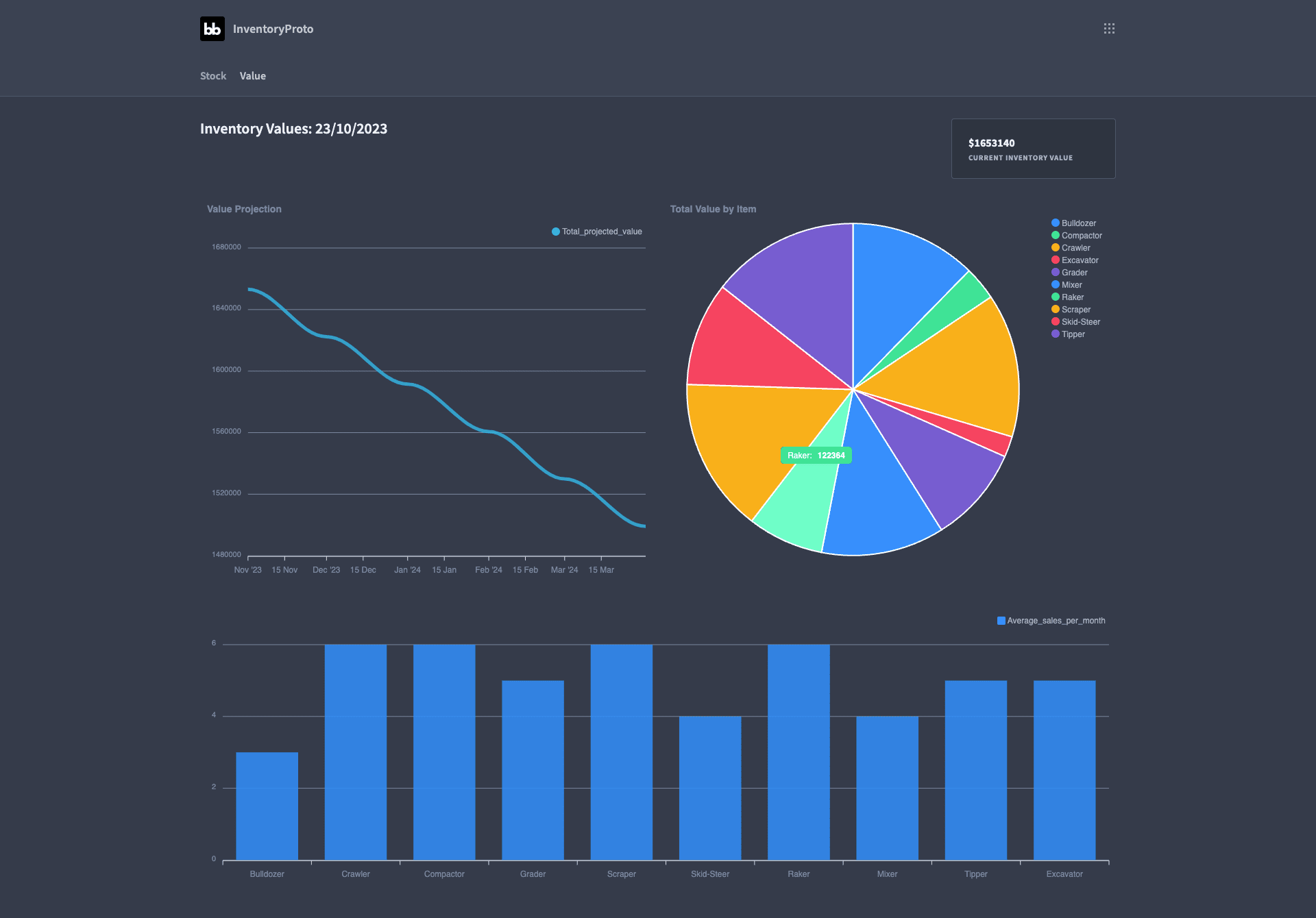
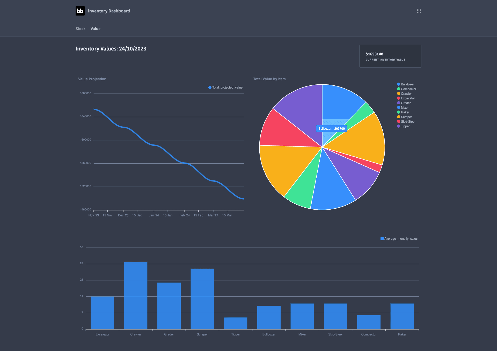
Our dashboard is going to be built around two screens. The first will concern our current inventory levels across different kinds of products - and the second will relate to the value of our stock at both an item level and aggregated for the inventory as a whole.
We’re going to present key metrics within each of these clusters for the current state of our inventory - as well as our expectation for how this will evolve over time.
We’ll do this by connecting our Budibase app to a Postgres database with two tables - called inventory and sales. You could pull in your own data from wherever your inventory management system stores it.
We’ll display some of the metrics as they’re stored here - but we’re also going to make heavy use of custom queries.
Don’t worry though, all of these will be provided below.
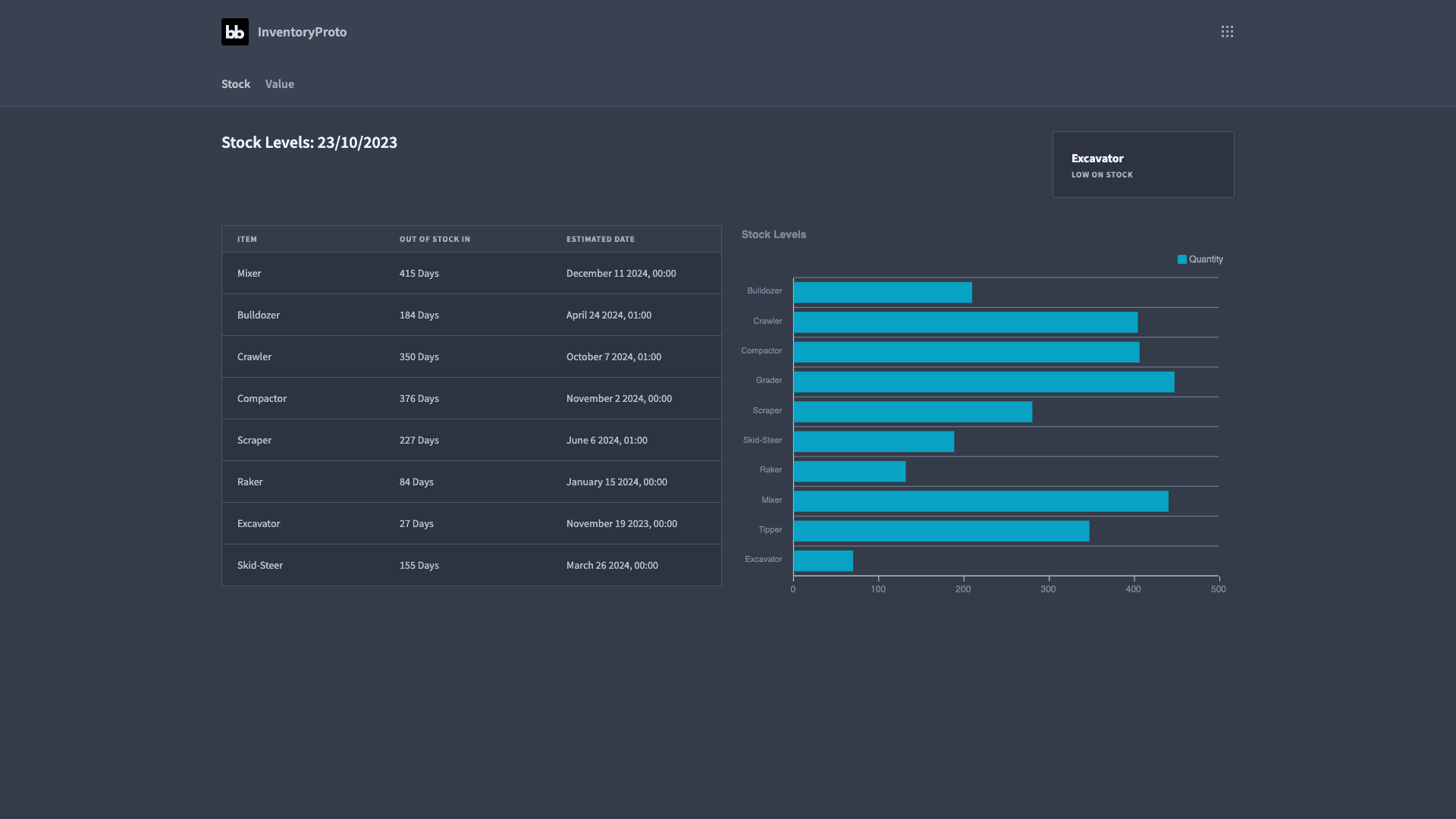
Here’s our first screen:
And our second:
How to build an inventory dashboard in 7 steps
So, now that we have a clear picture of what we want to build, let’s dive in.
If you haven’t already, create a free Budibase account.
1. Creating an app and connecting our data
The first thing we need to do is create a new Budibase application. We have the option of importing an app or using a pre-built template - but we’re going to start from scratch.
Then, we’re prompted to give our app a name:
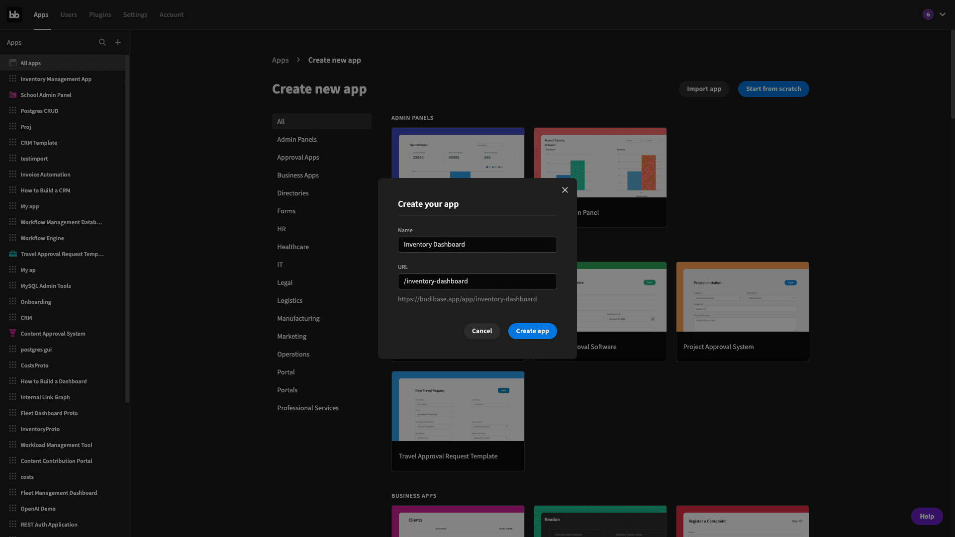
Budibase will use this to create a URL extension for our inventory dashboard too.
When we hit create app, the next screen will ask us to choose a data source for our app:
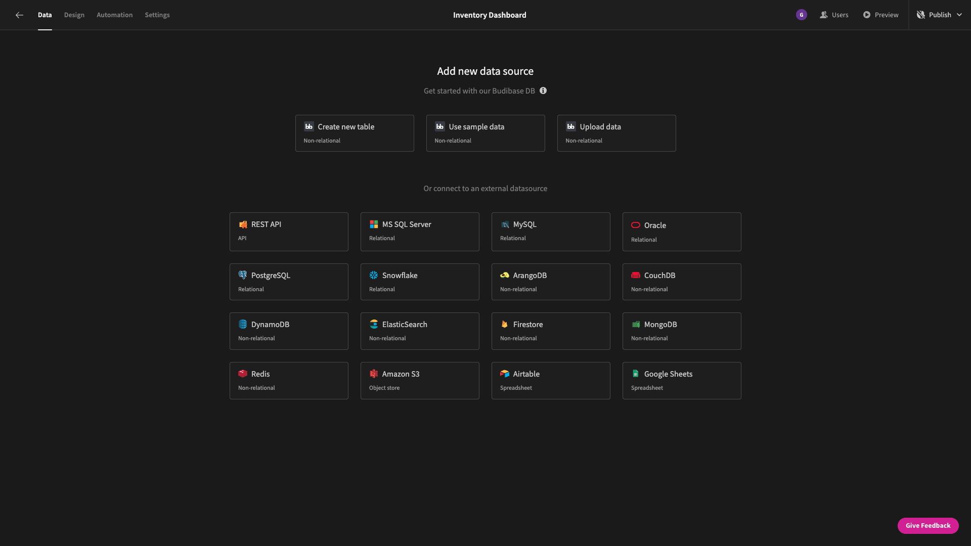
Budibase offers dedicated data connectors for REST API, Google Sheets, and a huge range of SQL and NoSQL DBMSs - alongside our internal database.
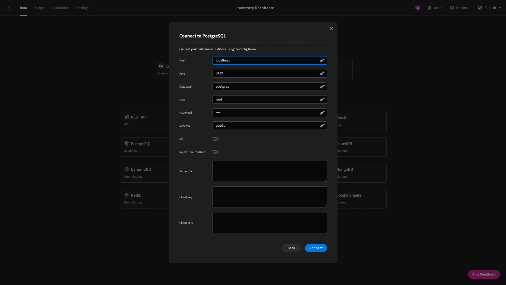
We’re going to choose Postgres. We’re then asked to enter our database credentials:
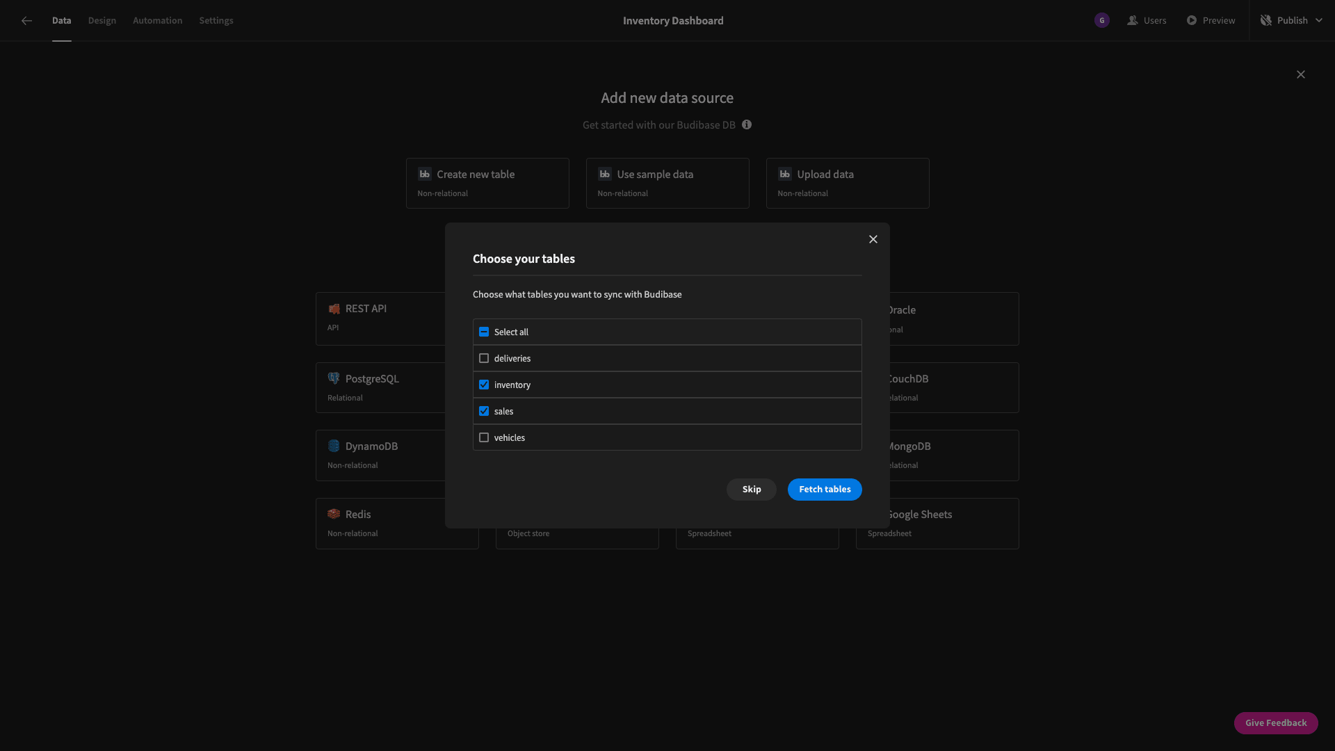
Then, we can choose which tables from our database we want to fetch and pull into Budibase. We have the option of choosing to fetch them all - but our database has some tables we don’t need for this app, so we’re only going to select inventory and sales:
We can now edit our tables in the Budibase backend - including full CRUD functionality:
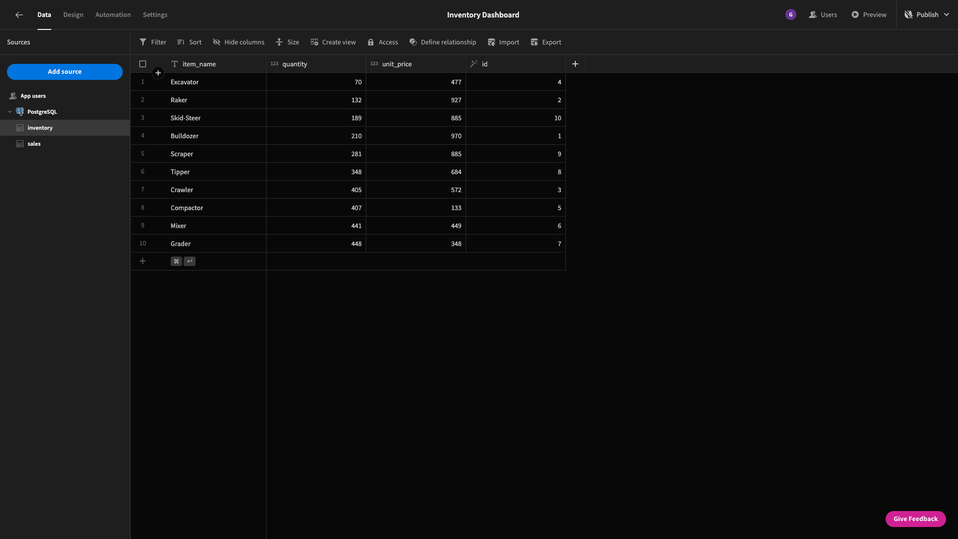
Our data model for this application is pretty simple. The inventory table contains four attributes - called item_name, quantity, unit_price, and id. The item_name attribute is unique for each row.
Sales also has four columns - item_name, date, quantity, and id.
We’re going to make one change to our data model before we continue - adding a column to display the total value of our stock for each item. We’ll start by creating a formula variable on the inventory table and calling it stock_value:
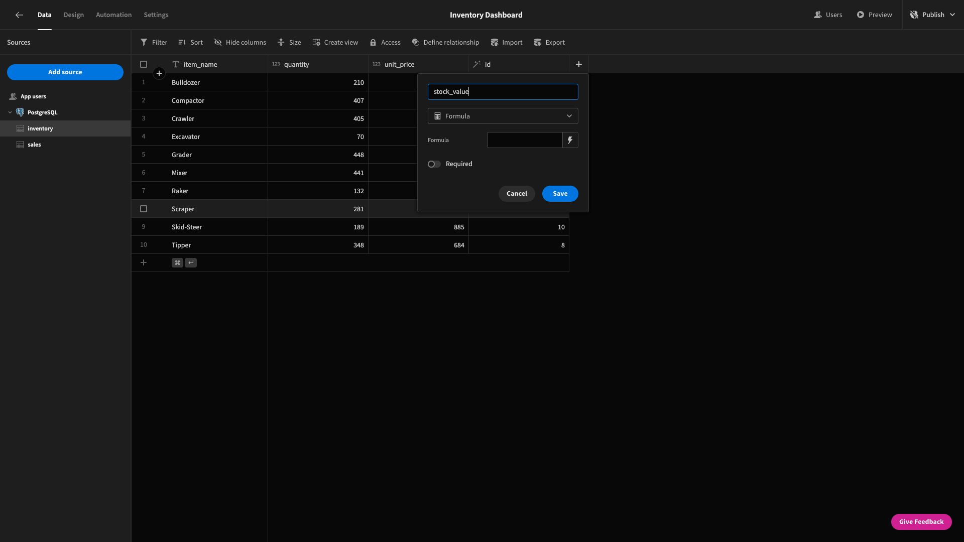
For the formula itself, we have the option of using handlebars or JavaScript bindings:
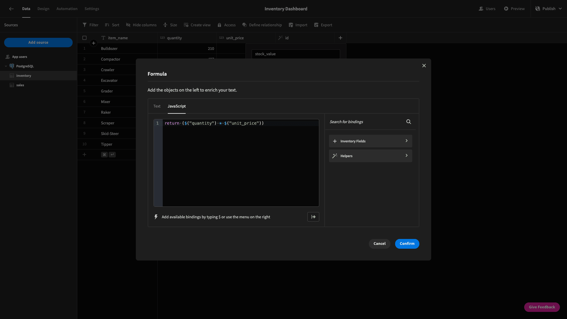
We’re using the following JavaScript expression to multiply the quantity by the unit_price for each item and return the result:
1return ($("quantity") * $("unit_price"))Here’s what this looks like in situ:
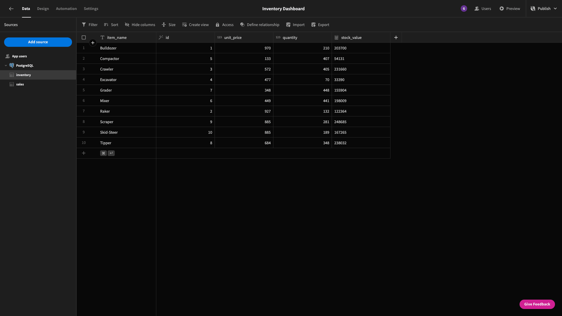
As we said earlier, though, the majority of our inventory dashboard will be built around the results of custom queries
2. Building our stock projections
The first screen we’ll build is going to be focused on our current inventory levels and how we expect these to change over time.
Here’s a reminder of what that will look like:
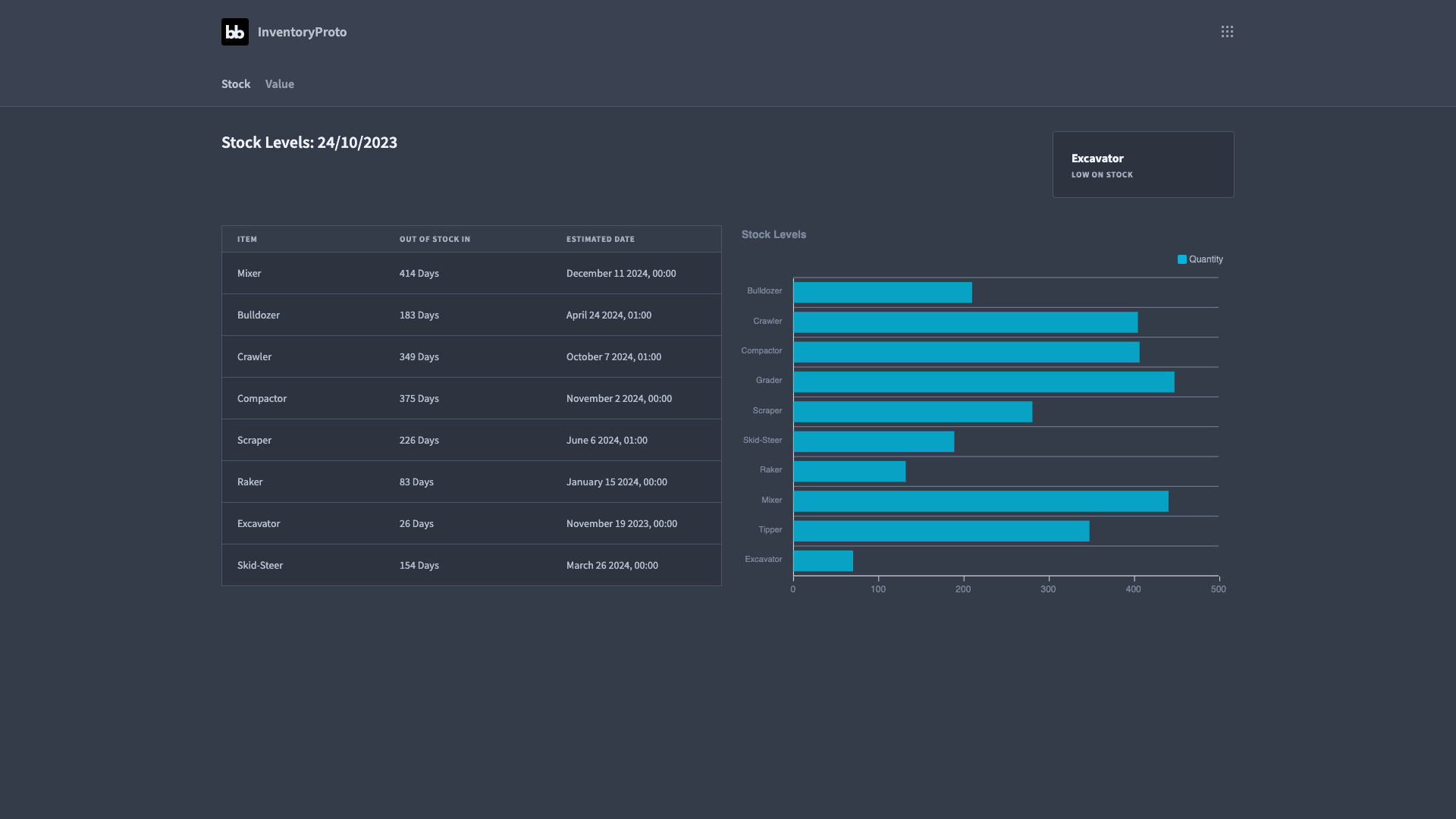
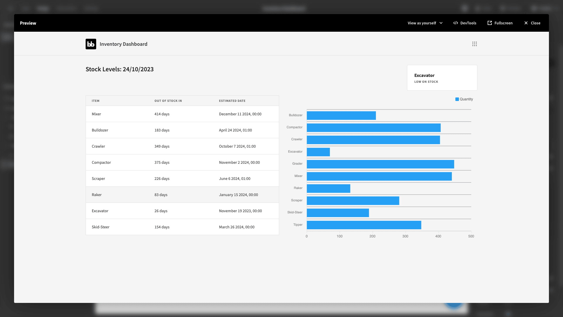
We have a table on the left showing when each item will run out of stock - based on historical sales data. The chart on the right shows the number of units that are currently in stock for each item.
There’s also a low stock notification card in the top right - displaying items that will run out of stock in the next 30 days - alongside a dynamic title that shows the current date.
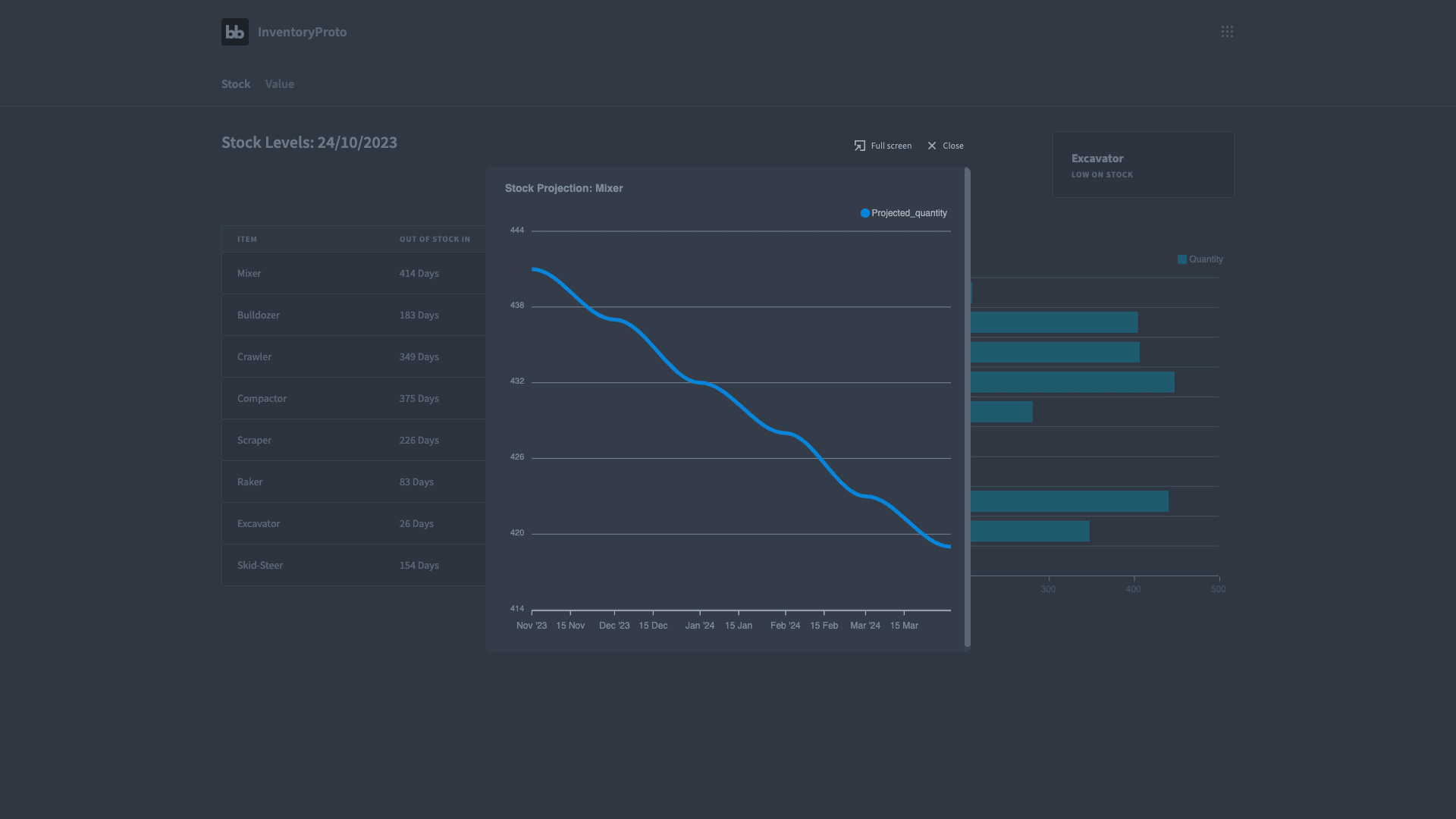
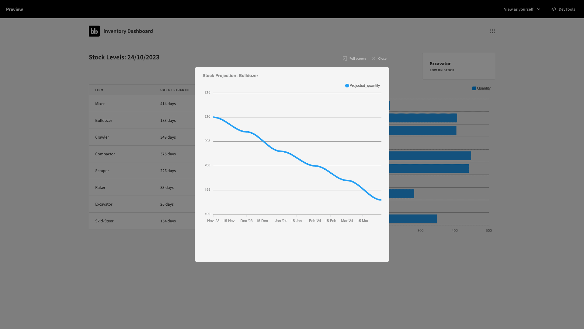
Additionally, the rows in our table are clickable - allowing us to access a line graph for the projected trend in our stock levels:
We already know how many of each item we have - along with the historical sales data for each. So, to create our table we need a query that will compare these two things and estimate when each item will run out of stock.
Head to the data section and add a new query within our Postgres data source:
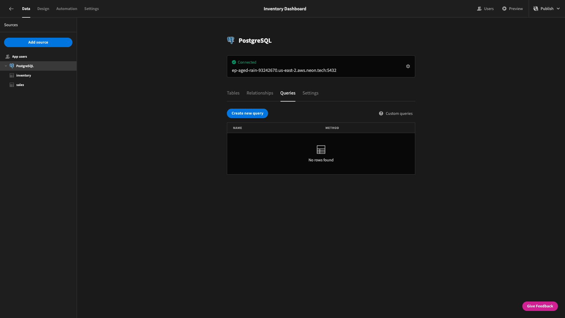
We can give our query a name, enter the query itself, and write any JavaScript we need to transform the results. We’ll call this OutOfStockProjections:
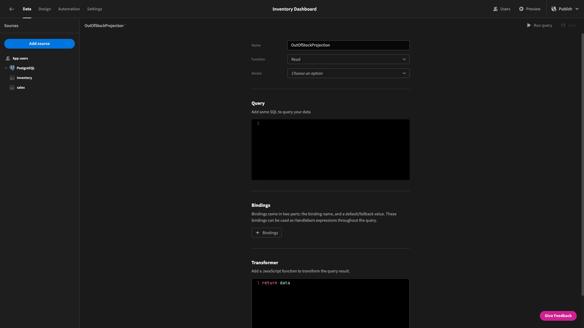
Our query is made up of three main elements:
- A common table expression called InventorySales to JOIN the data from the sales and inventory tables based on their item_name attributes.
- A second CTE called CumulativeSales to get the most recent sales date and the total historical sales volume for each item.
- A SELECT statement that returns the number of days until each item runs out of stock and the date that this will happen, based on the results of our CTEs.
Here’s the full query:
 1WITH InventorySales AS (
 2
 3 SELECT
 4
 5  i.item_name,
 6
 7  i.quantity AS inventory_quantity,
 8
 9  s.date AS sales_date,
10
11  s.quantity AS sales_quantity
12
13 FROM
14
15  inventory i
16
17 LEFT JOIN
18
19  sales s ON i.item_name = s.item_name
20
21),
22
23CumulativeSales AS (
24
25 SELECT
26
27  item_name,
28
29  inventory_quantity,
30
31  MAX(sales_date) AS last_sale_date,
32
33  SUM(sales_quantity) AS total_sales
34
35 FROM
36
37  InventorySales
38
39 GROUP BY
40
41  item_name, inventory_quantity
42
43)
44
45SELECT
46
47 item_name,
48
49 inventory_quantity,
50
51 CASE
52
53  WHEN total_sales >= inventory_quantity THEN NULL
54
55  ELSE last_sale_date + (inventory_quantity - total_sales) * interval '1 day'
56
57 END AS date_when_run_out,
58
59 CASE
60
61  WHEN total_sales >= inventory_quantity THEN NULL
62
63  ELSE EXTRACT(DAY FROM (last_sale_date + (inventory_quantity - total_sales) * interval '1 day' - CURRENT_DATE))
64
65 END AS days_until_run_out
66
67FROM
68
69 CumulativeSales;
This returns a data object for each item like:
 1{
 2
 3 "item_name": "Mixer",
 4
 5 "inventory_quantity": 441,
 6
 7 "date_when_run_out": "2024-12-11 00:00:00+00",
 8
 9 "days_until_run_out": "414"
10
11}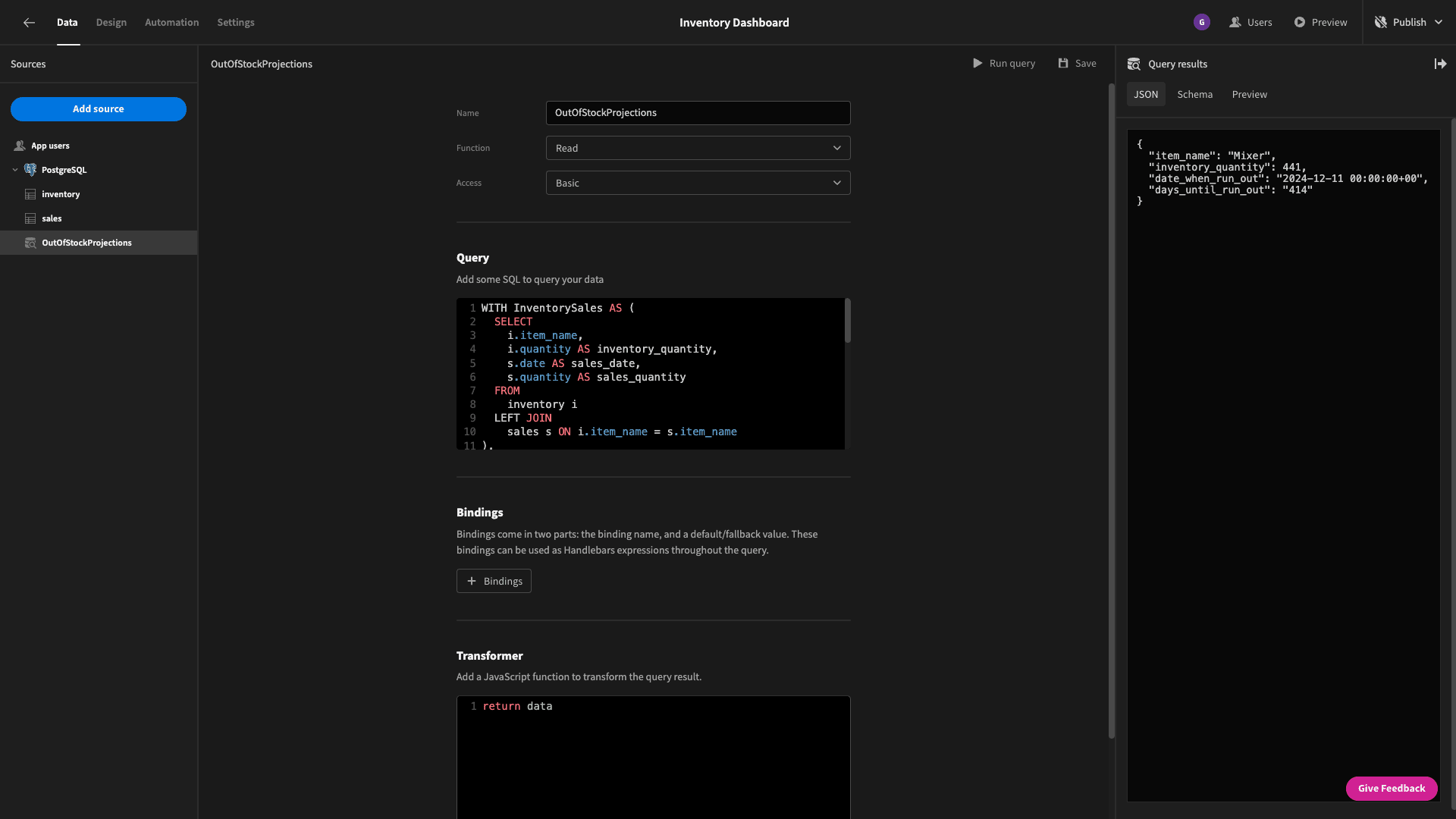
Now, head back to the design section and add a new blank screen.
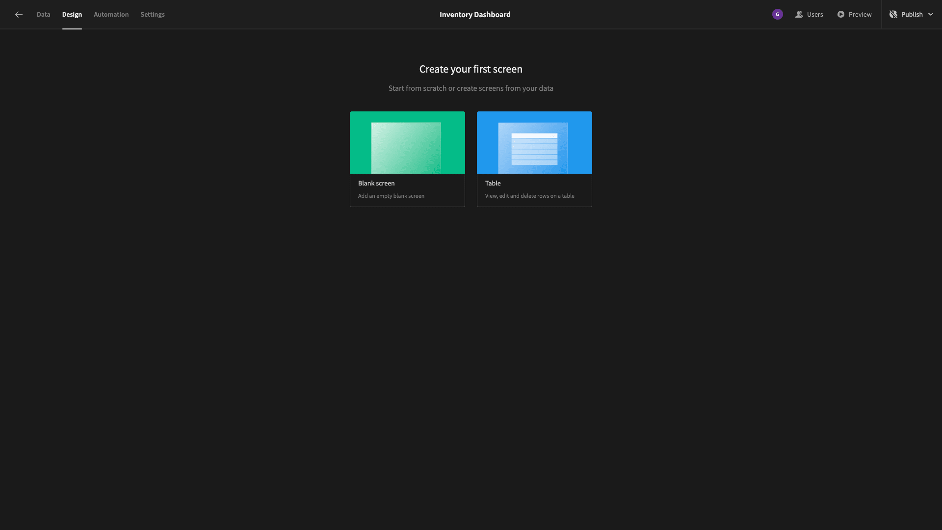
On this, we’ll add two horizontal containers:
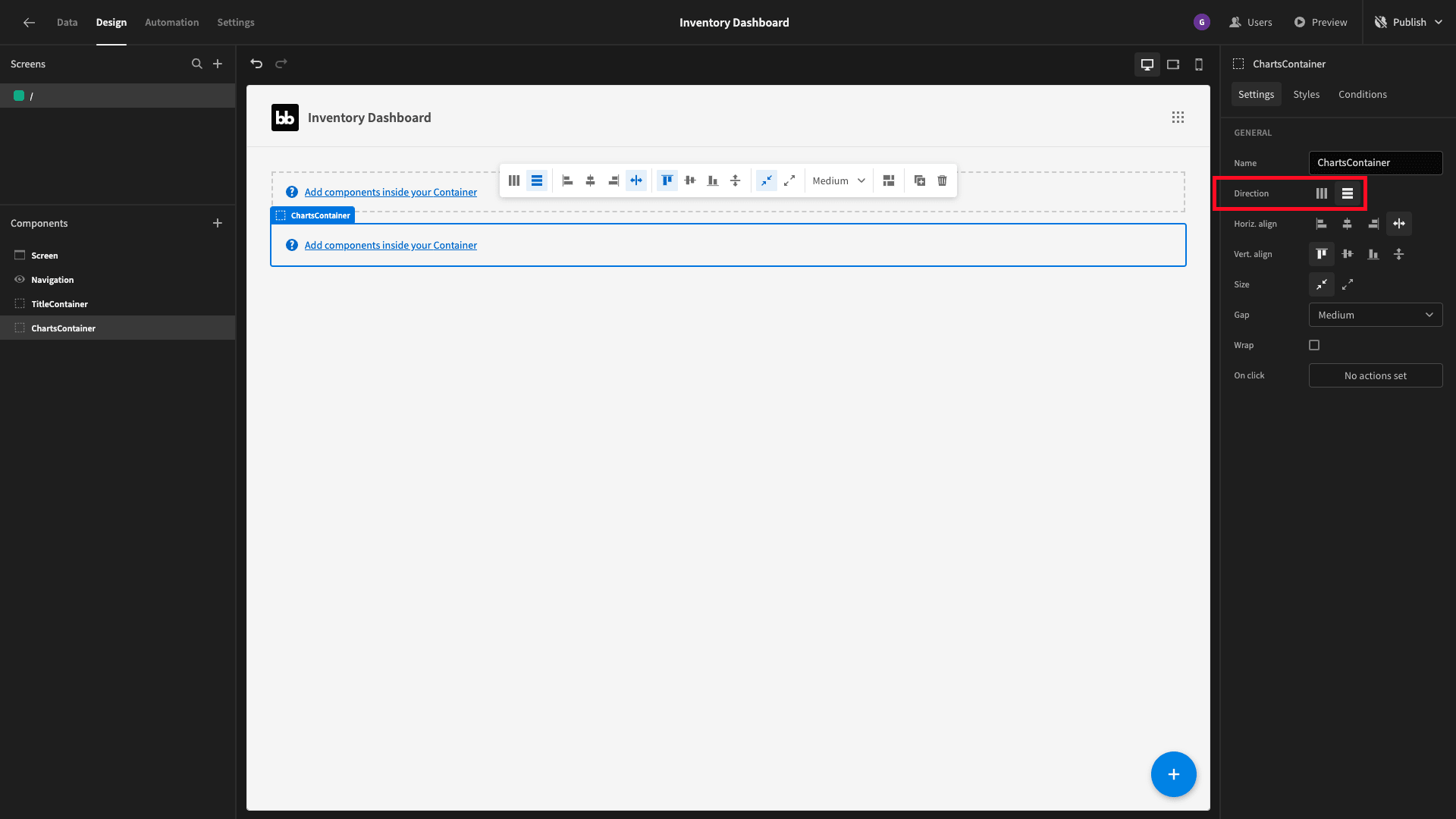
We’ll add a headline component nested inside our first container, with the following JavaScript binding as its text:
1var currentDate = new Date();
2
3return "Stock Levels: " + currentDate.getDate() + "/" + (currentDate.getMonth() + 1) + "/" + currentDate.getFullYear();
Beside this, we’ll place a cards block. This is a prebuilt set of components that will iterate over any data source we point it at and display the metrics for each entry that we configure it to.
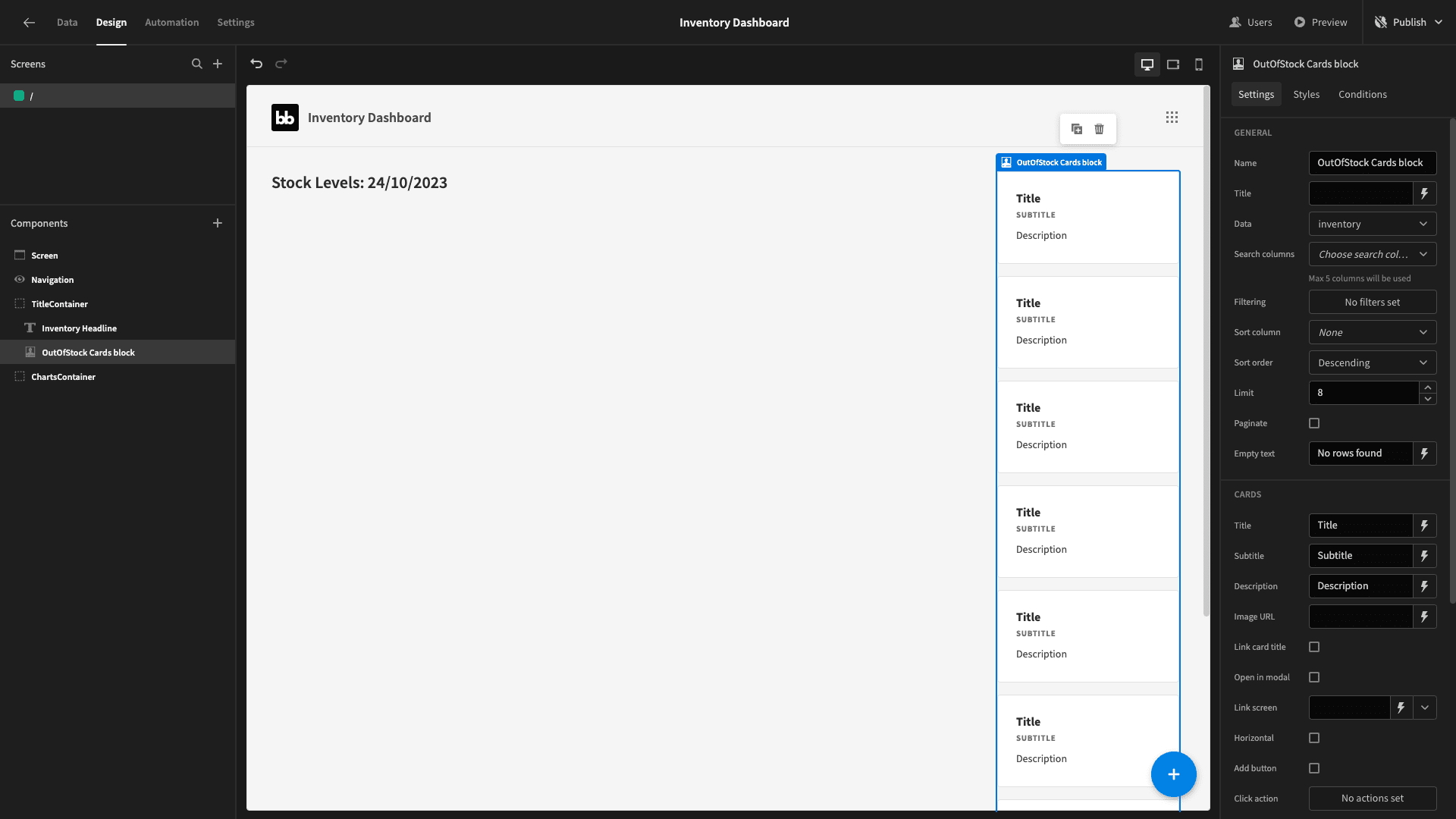
We’ll set our data to our new custom query:
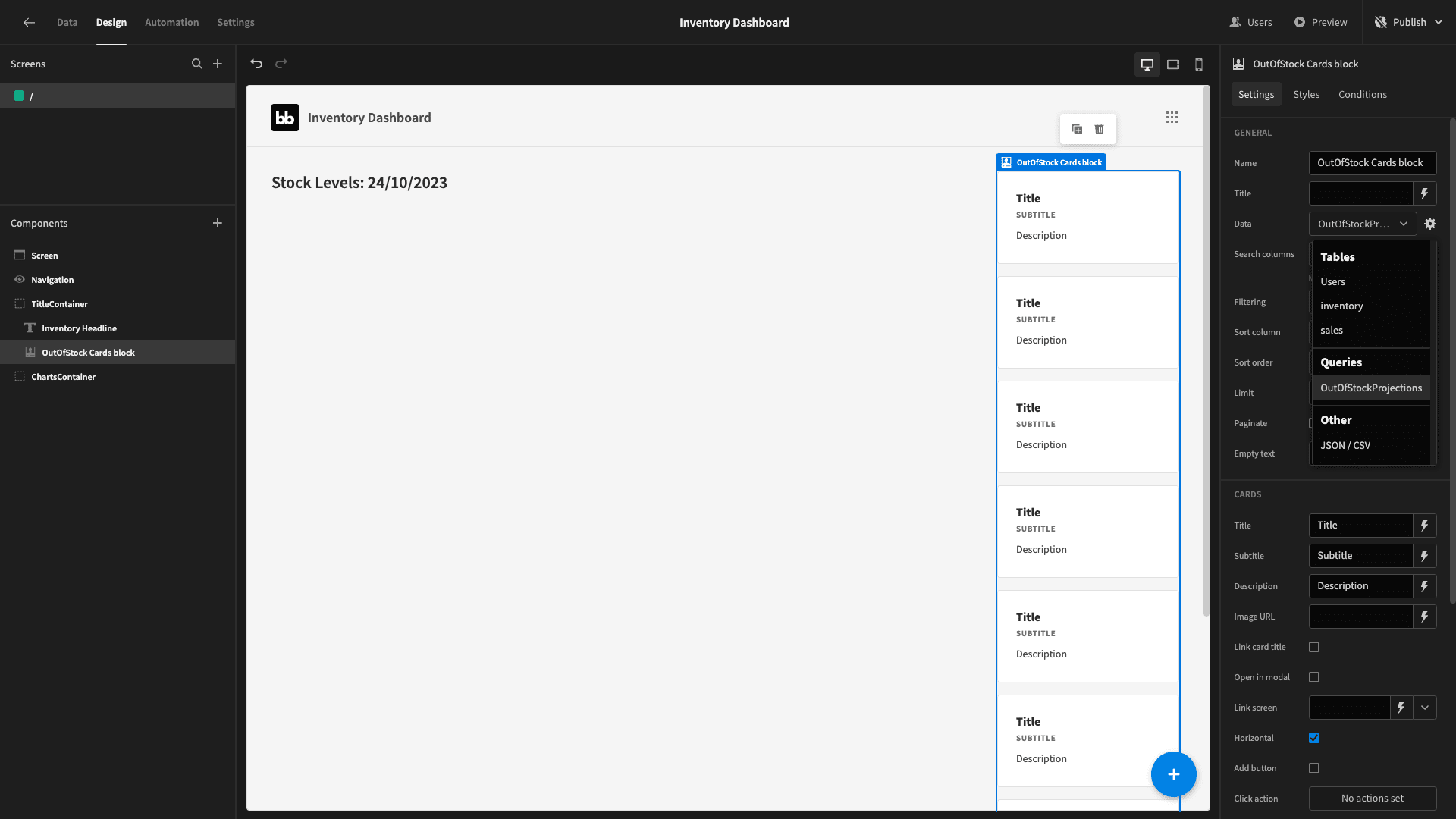
We’ll bind the title field to the item_name attribute.
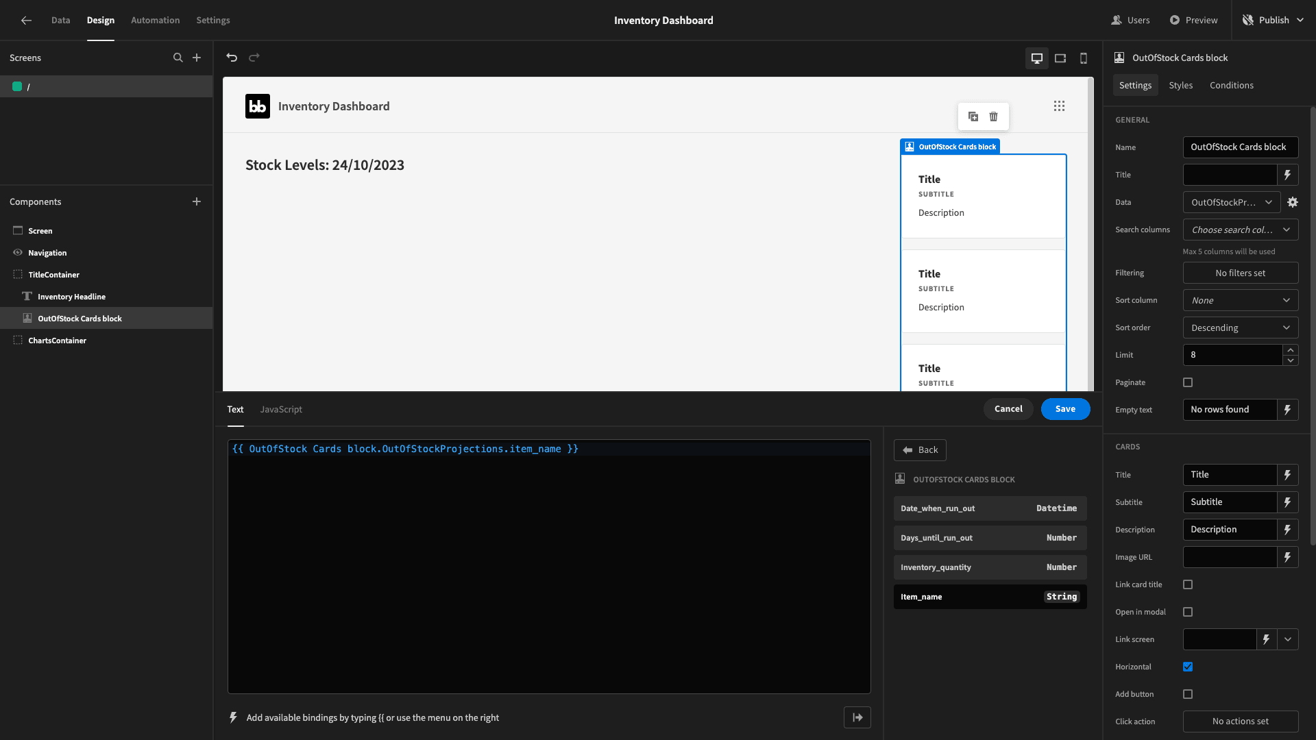
We’ll set the subtitle to Low on stock and leave the description blank.
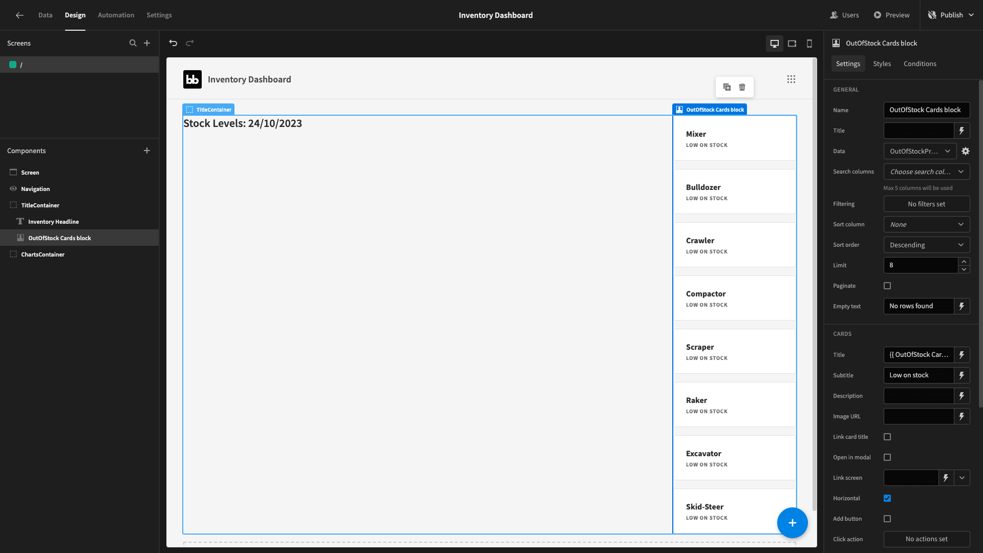
Finally, we’ll add a filter so that our cards block only displays the entries where the days_until_run_out attribute is less than or equal to 31 - so, items that will run out in the next month.
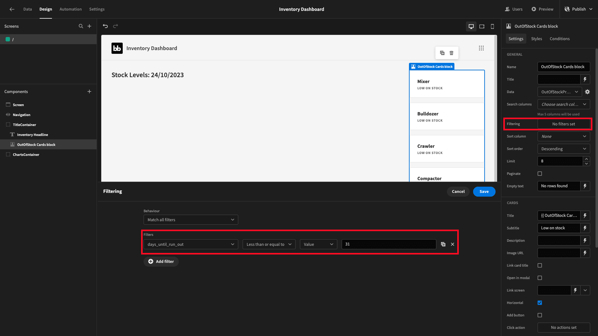
This gives us:
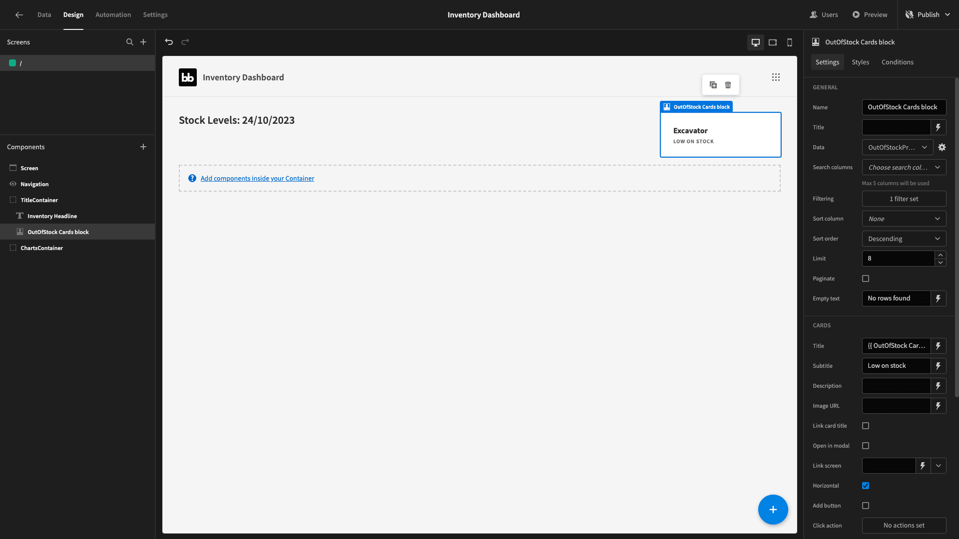
Next, we’ll add a table block inside our second container - and point this at our OutOfStockProjections query.
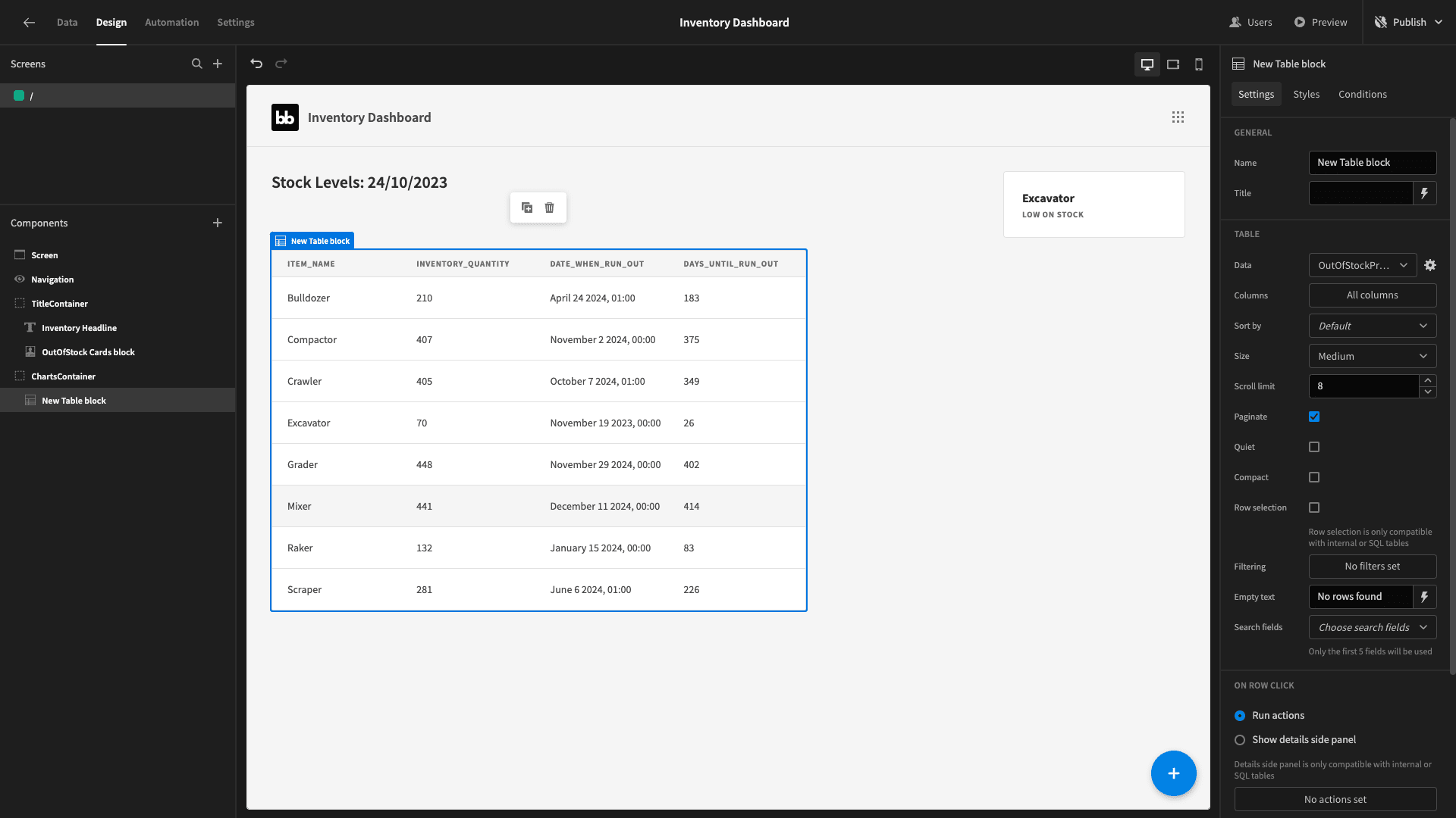
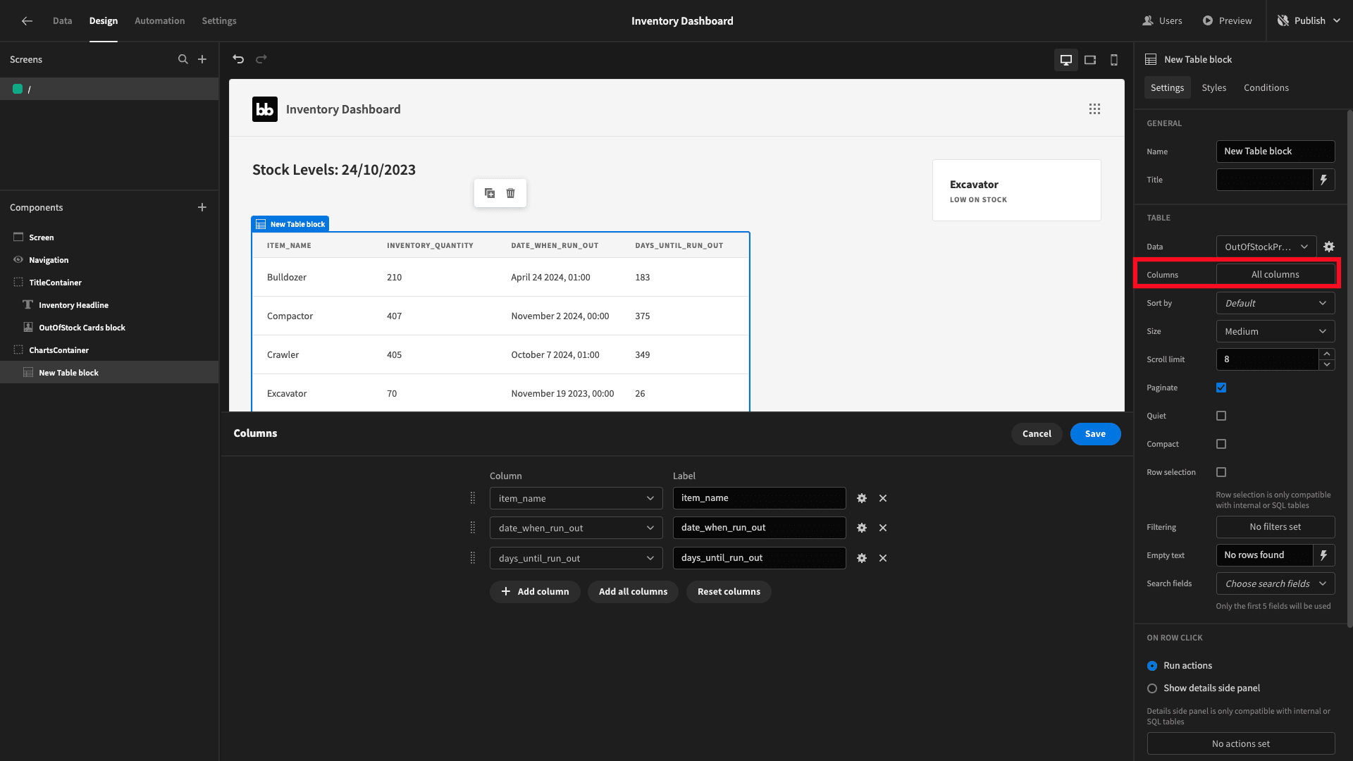
This displays all of the data we need it to, but it could be a little bit tidier. We’ll start by editing the displayed columns so that our table shows everything except the current quantity:
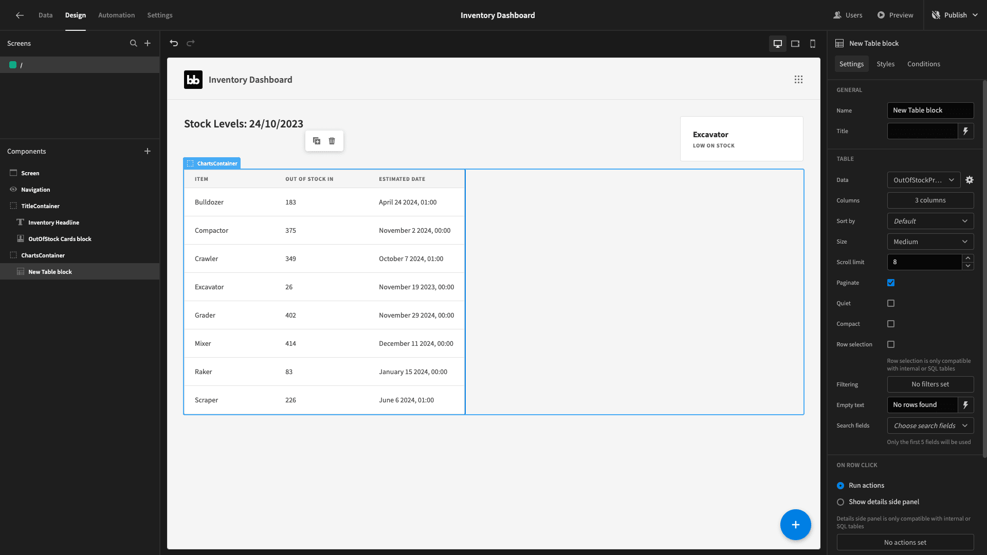
Then, we’ll give our remaining columns more readable names:
We’ll also use a handlebars expression to bind the value for our estimated days to:
1{{ Value }} days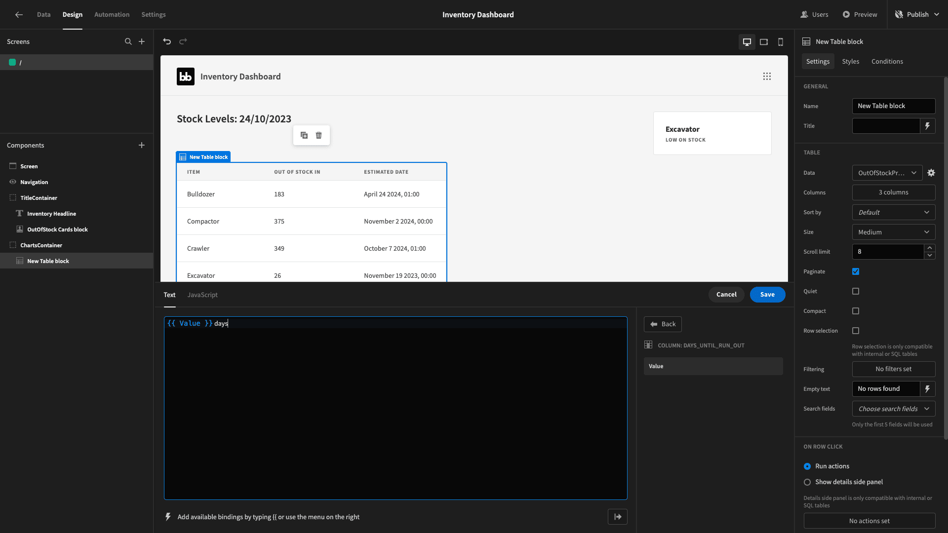
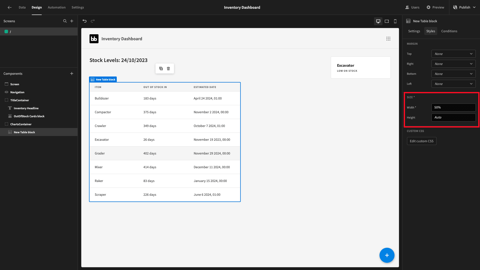
Lastly, under styles, we’ll set the table’s width to 50%:
Now, we want to display a stock forecast for each item when we click on any row of our table. To do this, we’ll need to create another blank screen. We’ll call this /projections/:item_name.
Appending :item_name to our URL lets us bind a value when we navigate to our new screen. We can do this with this column since the names in our table are unique. Otherwise, we’d want to use another unique identifier.
On this screen, we’re going to place a line graph - displaying our projected inventory levels over the next six months - based on the data we have in our sales table.
For this, we’ll need a new query - which we’ll call PerItemProjections.
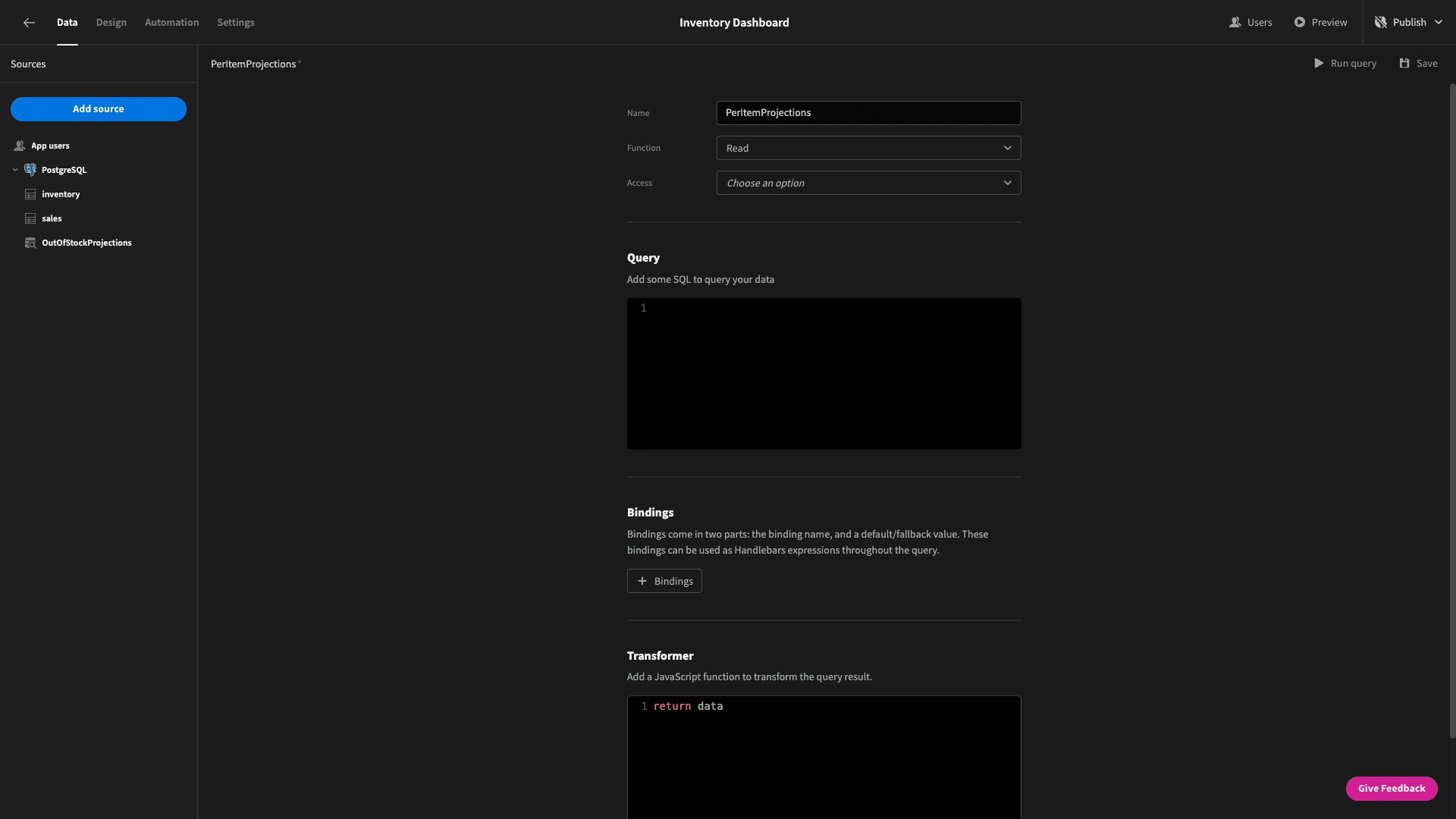
This will be quite similar to our previous query - with a few important differences. We’re going to start with three common table expressions:
- MonthlyAverageSales will calculate the number of each item we sell in a typical month.
- InventoryData will extract the relevant information from our inventory table.
- ProjectionMonths will create a series to return one row per month for the next six months.
Our main query will then return the item_name, the projection_month, the expected number of sales, and the expected total value of these sales.
The query we’ll use is:
 1WITH MonthlyAverageSales AS (
 2
 3 SELECT
 4
 5  item_name,
 6
 7  AVG(quantity) AS avg_monthly_sales
 8
 9 FROM
10
11  sales
12
13 GROUP BY
14
15  item_name
16
17),
18
19InventoryData AS (
20
21 SELECT
22
23  item_name,
24
25  quantity AS initial_quantity,
26
27  unit_price
28
29 FROM
30
31  inventory
32
33),
34
35ProjectionMonths AS (
36
37 SELECT
38
39  generate_series(
40
41   DATE_TRUNC('month', CURRENT_DATE + INTERVAL '1 month'),
42
43   DATE_TRUNC('month', CURRENT_DATE + INTERVAL '6 months'),
44
45   interval '1 month'
46
47  ) AS projection_month
48
49)
50
51SELECT
52
53 i.item_name,
54
55 p.projection_month,
56
57 ROUND(GREATEST(i.initial_quantity - COALESCE(s.avg_monthly_sales, 0) * DATE_PART('month', AGE(p.projection_month, CURRENT_DATE)), 0)) AS projected_quantity,
58
59 ROUND(GREATEST(i.initial_quantity - COALESCE(s.avg_monthly_sales, 0) * DATE_PART('month', AGE(p.projection_month, CURRENT_DATE)), 0) * i.unit_price) AS projected_value
60
61FROM
62
63 InventoryData i
64
65CROSS JOIN
66
67 ProjectionMonths p
68
69LEFT JOIN
70
71 MonthlyAverageSales s ON i.item_name = s.item_name
72
73ORDER BY
74
75 i.item_name, p.projection_month;
This will return a data object as shown below for each item for each of the next six months:
 1{
 2
 3 "item_name": "Bulldozer",
 4
 5 "projection_month": "2023-11-01 00:00:00",
 6
 7 "projected_quantity": 210,
 8
 9 "projected_value": 203700
10
11}
Of course, this is only an example of the kind of query we could use for this projection. The beauty of Budibase is that you can use your own SQL statements in order to create logic that matches your real life procurement, sales, and inventory management processes.
Now, save that and head back to our new screen.
We’ll add another chart block, set the data to our new query and the type to line. We’ll also add a filtering expression so that item_name is equal to {{ URL.item_name }}.
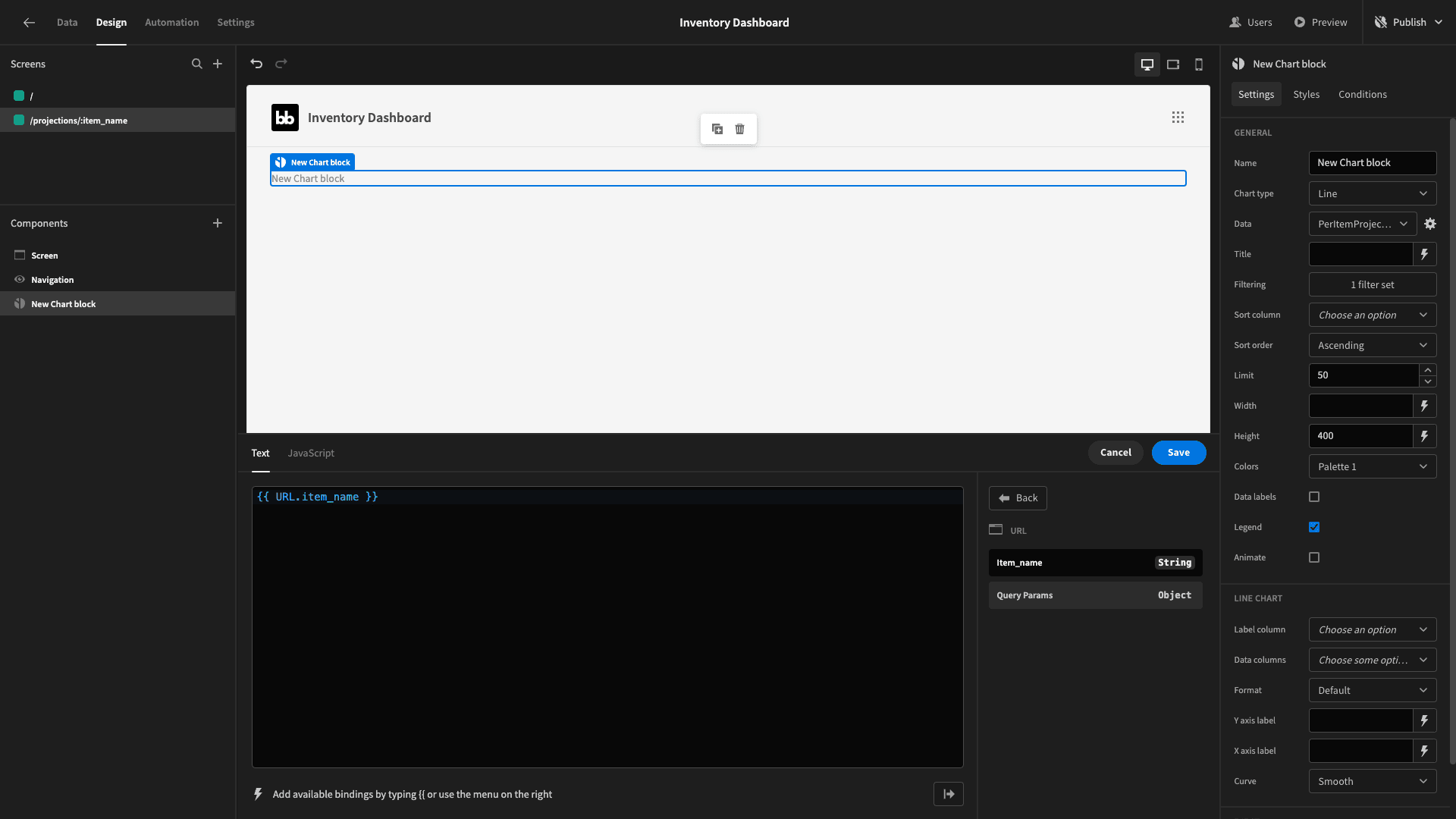
Now, back on our table we’ll add a new on click action to navigate to /projections/{{ clicked row.item_name }}. We’ll also tick the box to open this in a modal screen.
Now, when we click on any row in our table, we’ll see a chart like this:

Lastly, we’ll set our chart’s title to Stock Projection: {{ URL.item_name }}.
3. Adding a stock levels chart
Next, we’ll add a chart block beside our table. This is going to show the current stock levels for each item - so we can just point it at our inventory table, since we already have a quantity attribute.
We’ll choose bar as our chart type.
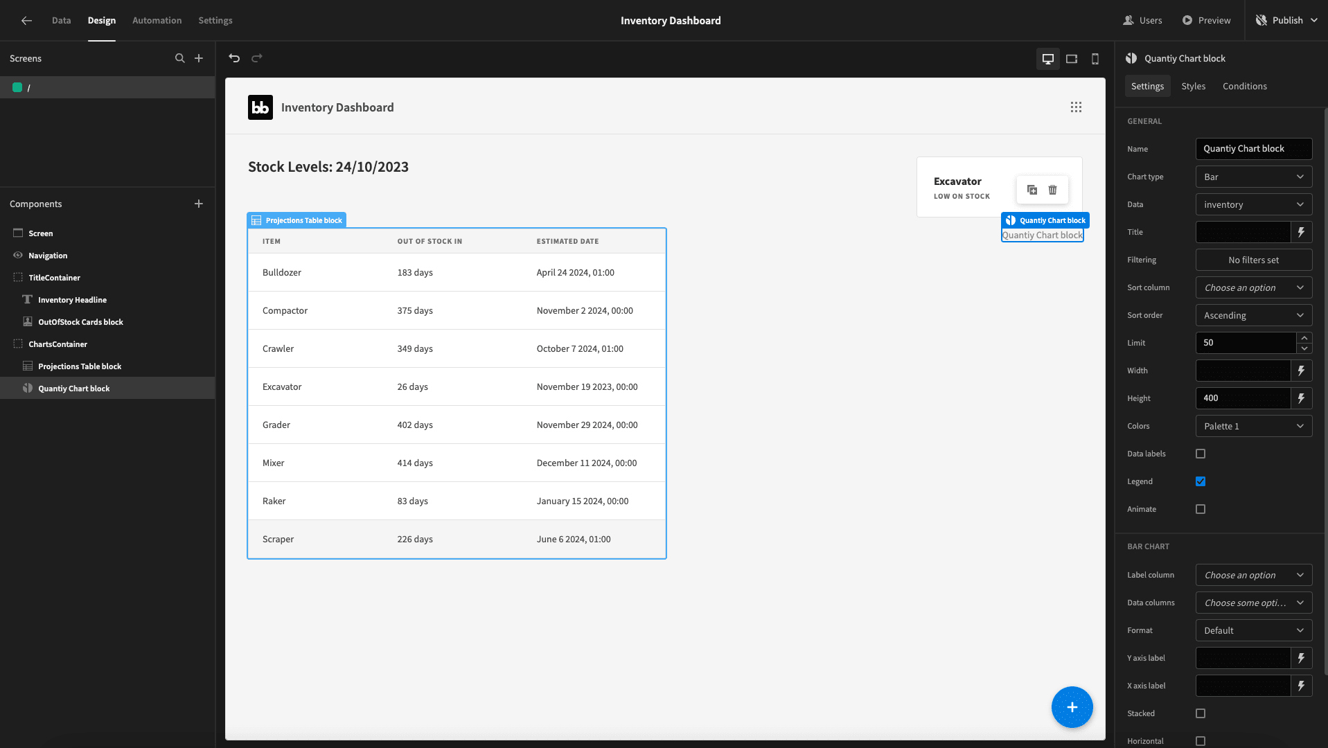
This won’t display anything until we tell it which attributes to use for each axis.
We’ll set the label column to item_name and the data column to quantity - as well as checking the horizontal option box:
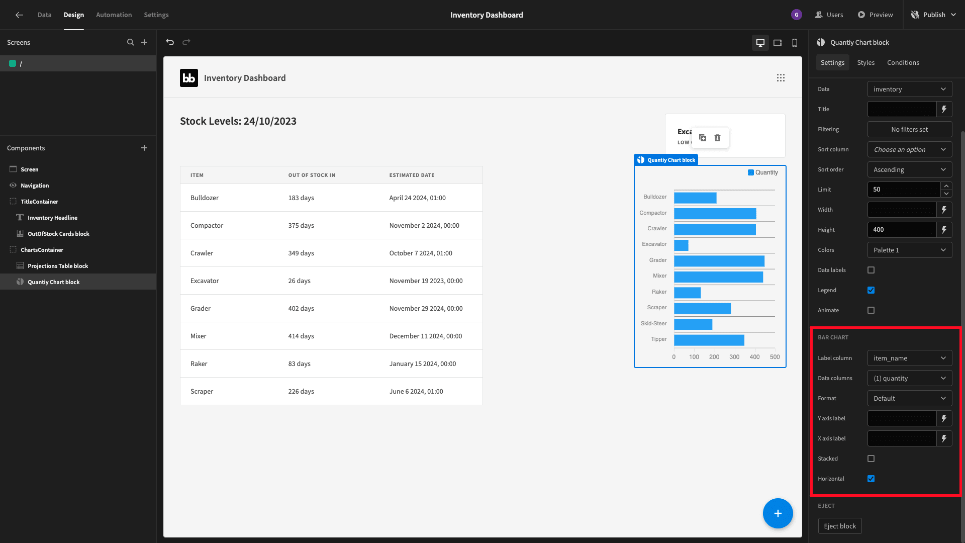
Finally, we’ll set the width to 50% and give our chart a fixed height of 500px. Here’s what we have so far:
We’ll also give this chart a title to give context to what it’s displaying:
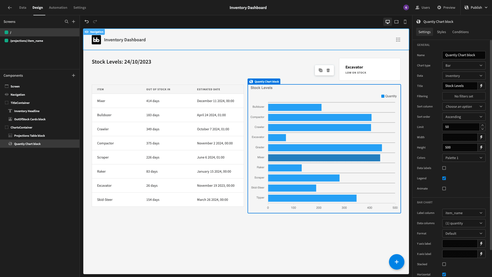
And that’s our first screen done.
4. Stock value analytics
Next, we’ll create a third screen called /value by duplicating our existing screen. We’ll then remove our table and chart blocks, leaving us with:
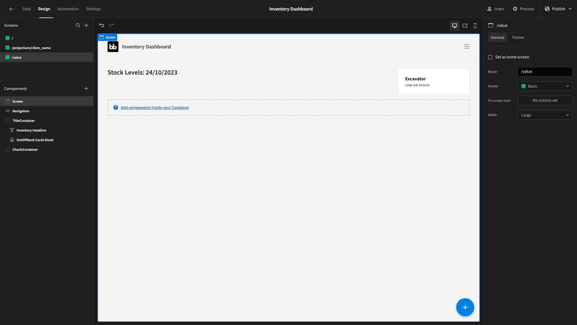
The first thing we’ll do is update the title to read Inventory Values and the current date.
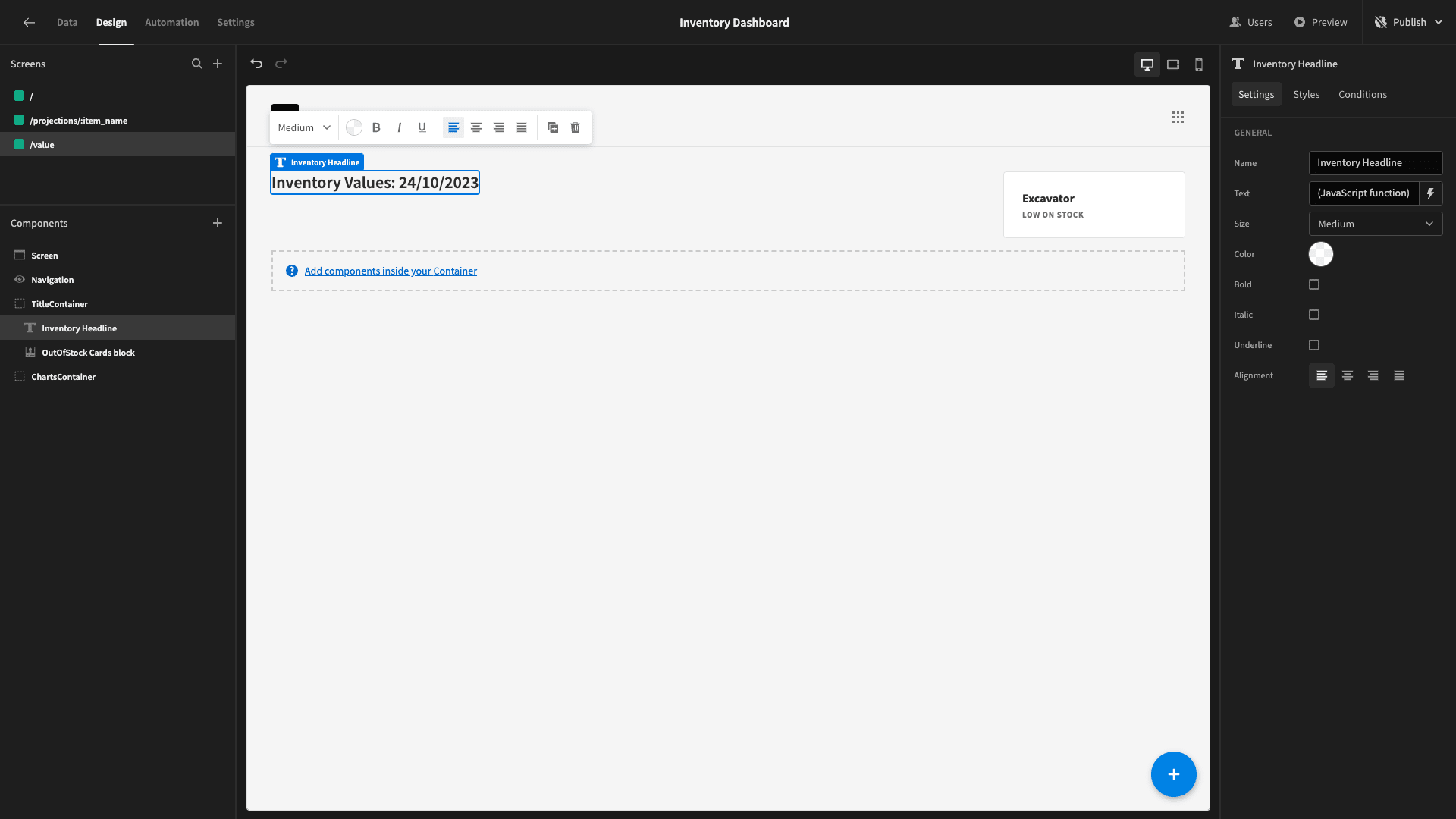
We want to edit our card to display the total value of our inventory at the present moment.
To do this, we’ll create a new query called CurrentInventoryValue. This one will be pretty simple - we just need the SUM of the quantity times the SUM of the unit_price from our sales table.
So, the query is:
1SELECT SUM(quantity * unit_price) AS total_value
2
3FROM inventory;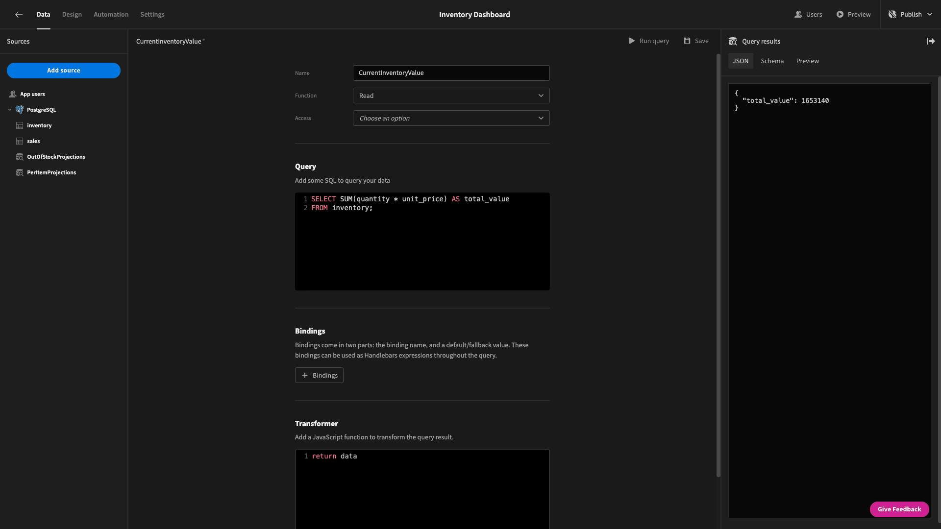
This returns the following data object:
1{
2
3 "total_value": 1653140
4
5}
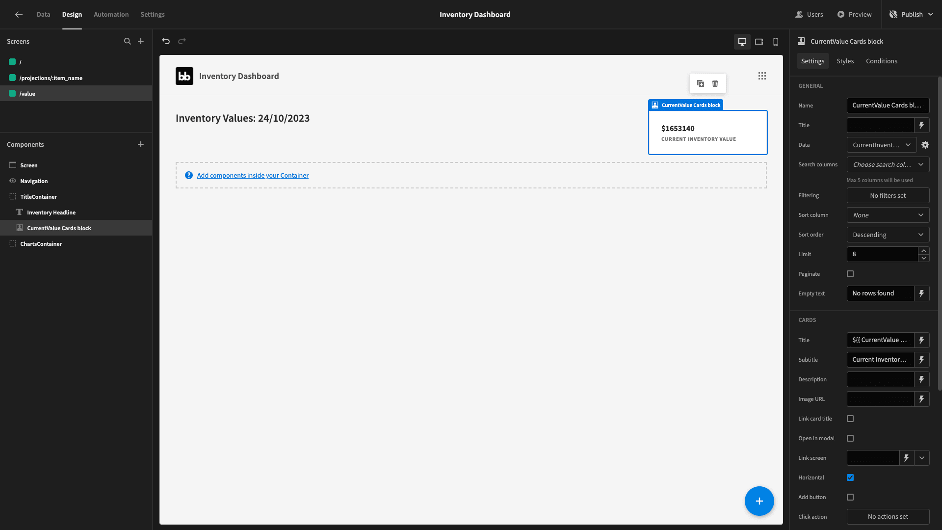
We’ll bind the output of this to the title of our existing card with a dollar sign in front of it - and set the subtitle to current inventory value. We’ll also need to remove our filtering expression. This gives us:
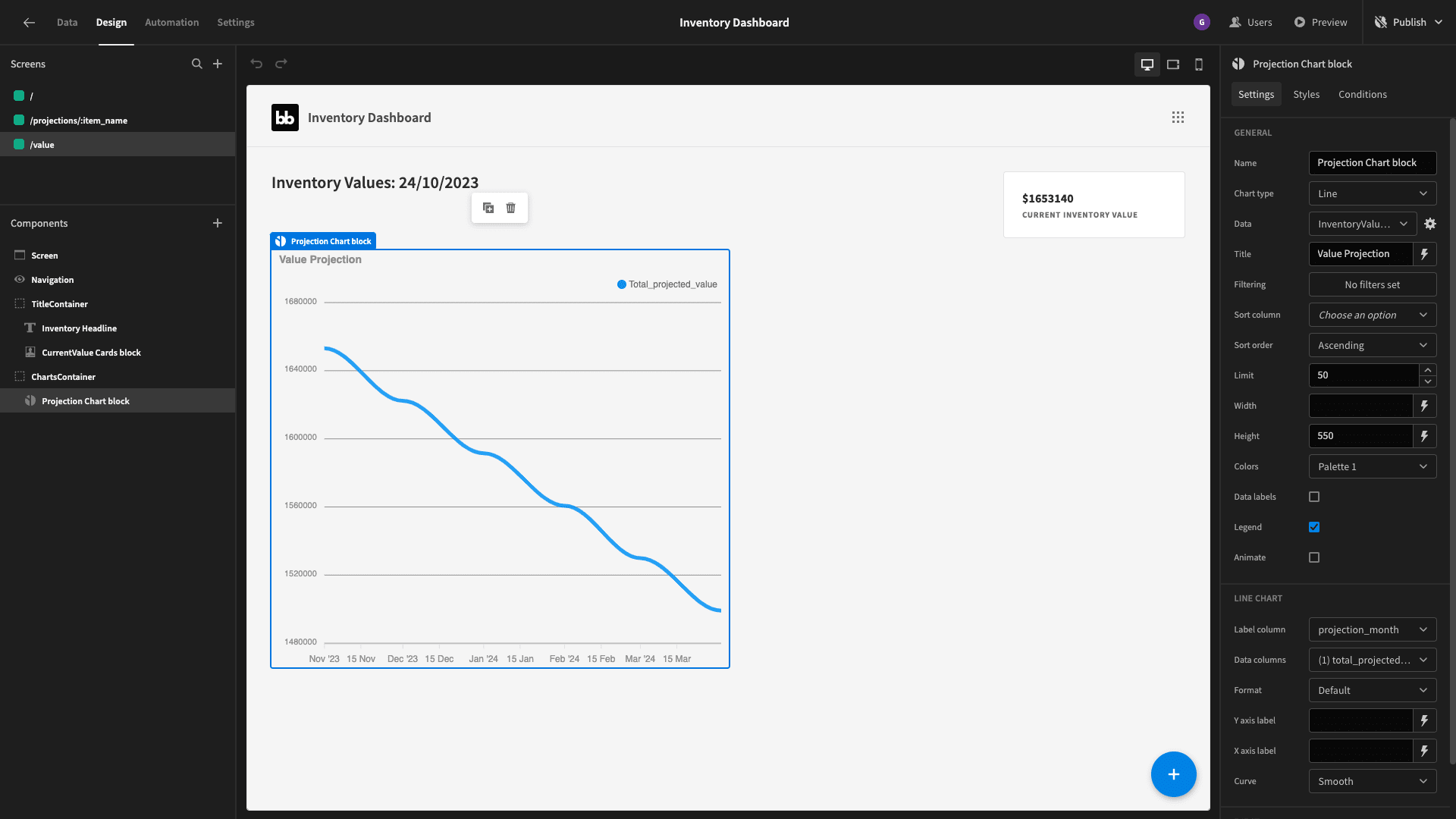
Inside our horizontal container, we’re going to place two charts. The first will be a line graph showing the projected trend in our overall inventory value.
We’ll add a new query called InventoryValueProjection. Just like earlier, we’re going to use three CTEs:
- MonthlyAverageSales - to calculate the average monthly sales for each item.
- InventoryDate - to fetch the data we need about each inventory item.
- ProjectionMonth - to generate a series with one row per month for the next six months.
We’ll then use this information to SELECT the projection_month and the SUM of the average sales values for all of our items.
The specific query we’ll use is:
 1WITH MonthlyAverageSales AS (
 2
 3 SELECT
 4
 5  item_name,
 6
 7  AVG(quantity) AS avg_monthly_sales
 8
 9 FROM
10
11  sales
12
13 GROUP BY
14
15  item_name
16
17),
18
19InventoryData AS (
20
21 SELECT
22
23  item_name,
24
25  quantity AS initial_quantity,
26
27  unit_price
28
29 FROM
30
31  inventory
32
33),
34
35ProjectionMonths AS (
36
37 SELECT
38
39  generate_series(
40
41   DATE_TRUNC('month', CURRENT_DATE + INTERVAL '1 month'),
42
43   DATE_TRUNC('month', CURRENT_DATE + INTERVAL '6 months'),
44
45   interval '1 month'
46
47  ) AS projection_month
48
49)
50
51SELECT
52
53 p.projection_month,
54
55 SUM(ROUND(GREATEST(i.initial_quantity - COALESCE(s.avg_monthly_sales, 0) * DATE_PART('month', AGE(p.projection_month, CURRENT_DATE)), 0) * i.unit_price)) AS total_projected_value
56
57FROM
58
59 InventoryData i
60
61CROSS JOIN
62
63 ProjectionMonths p
64
65LEFT JOIN
66
67 MonthlyAverageSales s ON i.item_name = s.item_name
68
69GROUP BY
70
71 p.projection_month
72
73ORDER BY
74
75 p.projection_month;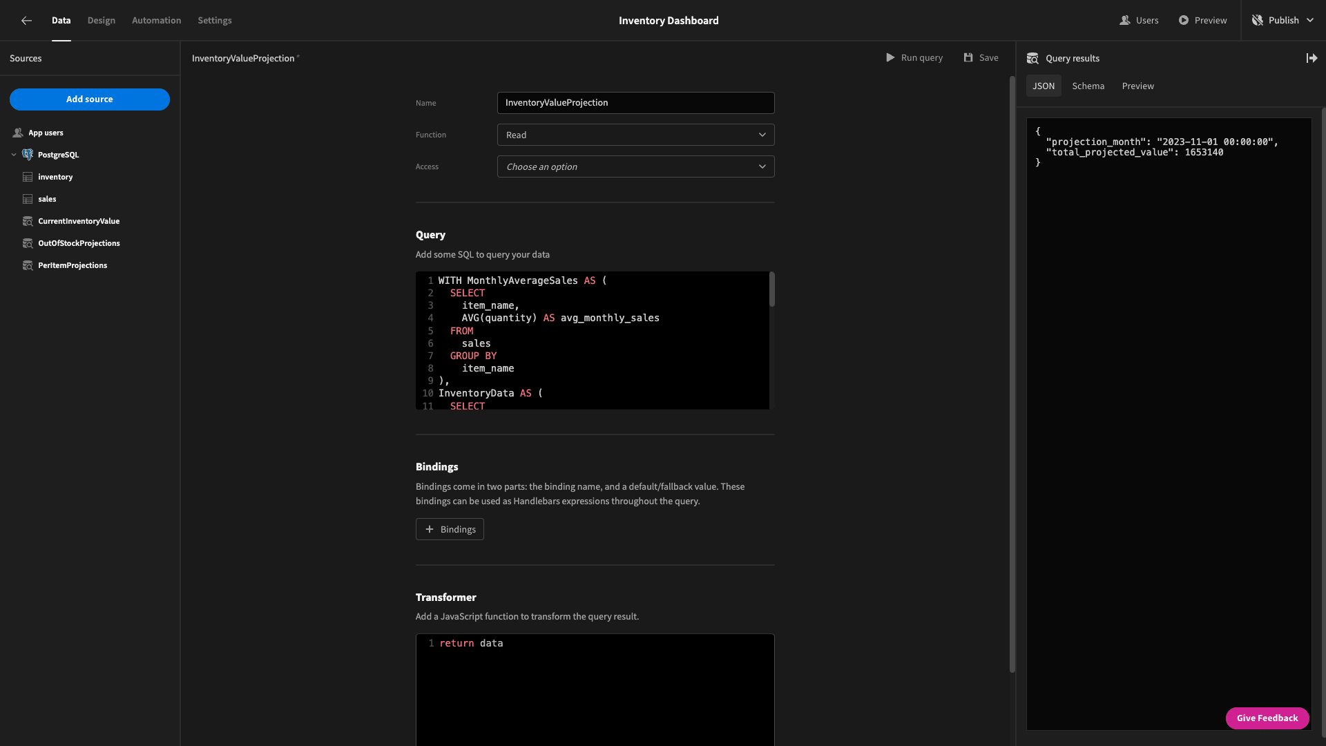
The returned data objects look like this:
1{
2
3 "projection_month": "2023-11-01 00:00:00",
4
5 "total_projected_value": 1653140
6
7}
Let’s head back to our /value screen. Inside our container, we’ll add a chart block to display our new information on a line graph. We’ll add a title, and give this a width of 50% and a fixed height of 550px.
5. Breaking down values by item
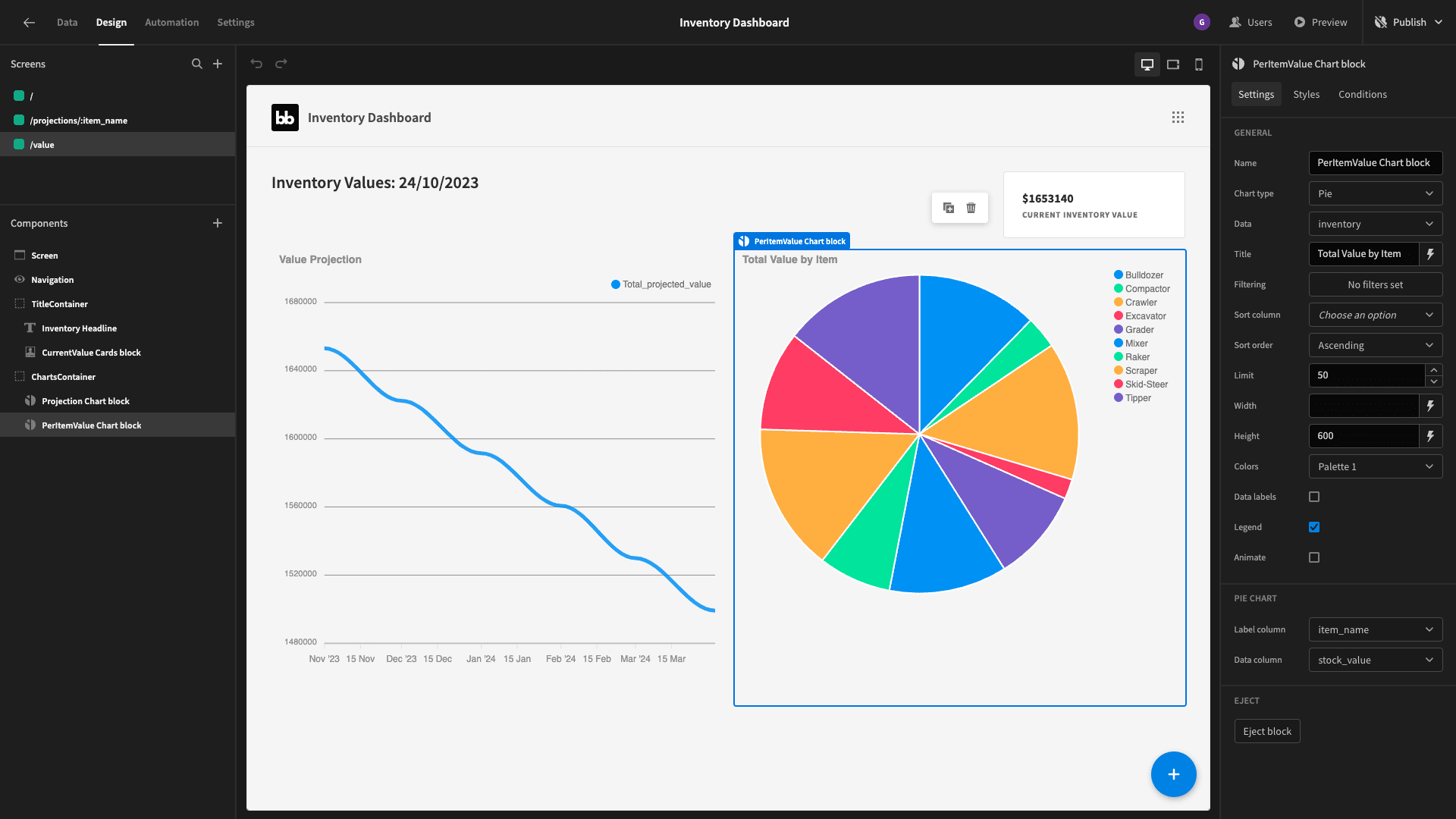
Beside this graph, we want a pie chart that displays the total value for each individual item. The data is set to our inventory table - with the label column as item_name and the data column as our stock_value formula variable from earlier.
We’ll set the height to 600px and the width to 50%.
6. Monthly sales by item
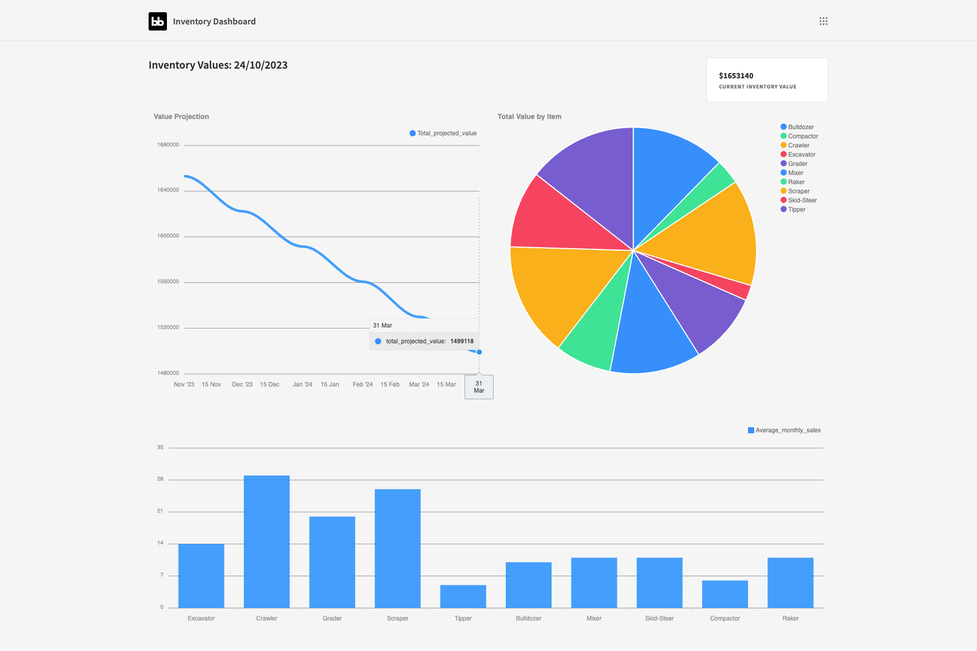
Lastly, we want to place a bar chart at the bottom of this screen, displaying the average number of sales for each item in our inventory table - based on the data in our sales table.
We’ll create a query called AverageMontlySalesByItem. This time, we’ll start with two CTEs:
- MonthlySales calculates the total number of units sold for each item each month.
- MonthlyAverages uses a window function to calculate the average number of units sold per item per month.
We then use a LEFT JOIN to SELECT the appropriate item_name from our inventory table alongside the average number of units sold per month.
So, the query is:
 1WITH MonthlySales AS (
 2  SELECT
 3    item_name,
 4    SUM(quantity) AS total_quantity,
 5    COUNT(DISTINCT DATE_TRUNC('month', date)) AS total_months
 6  FROM
 7    sales
 8  GROUP BY
 9    item_name
10)
11SELECT
12  i.item_name,
13  ROUND(COALESCE(SUM(total_quantity) / NULLIF(SUM(total_months), 0), 0)) AS average_monthly_sales
14FROM
15  inventory i
16LEFT JOIN MonthlySales s ON i.item_name = s.item_name
17GROUP BY
18  i.item_name;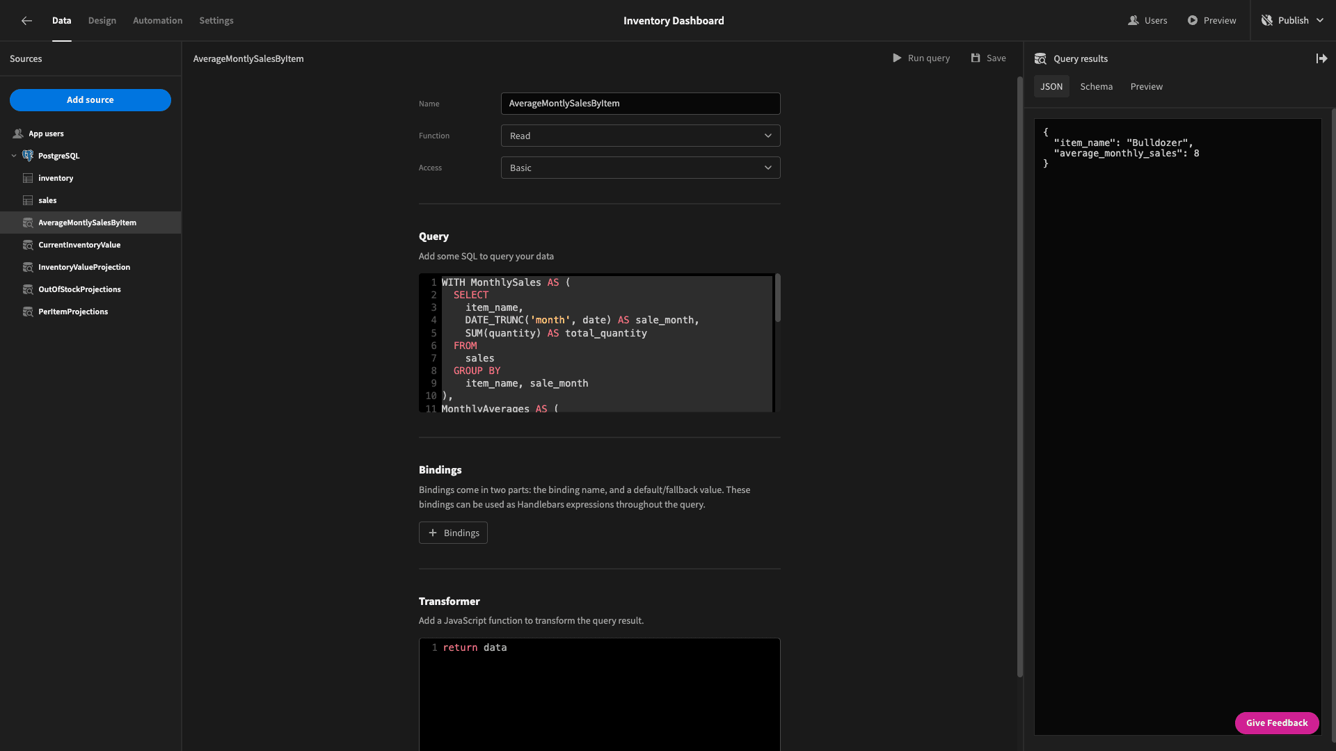
The returned data object should look like this:
1{
2
3 "item_name": "Bulldozer",
4
5 "average_monthly_sales": 8
6
7}
When we create our bar chart, the finished inventory dashboard screen looks like this:
7. Design tweaks
To wrap up, we’ll make a few changes to the UX of our dashboard. First, we want to add links to both of our screens to the navigation bar:
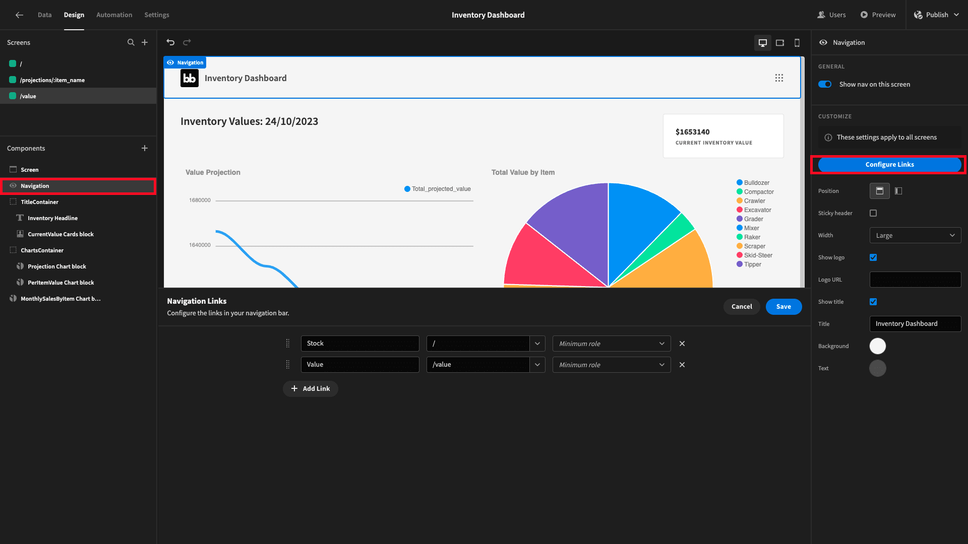
Here’s what this looks like:
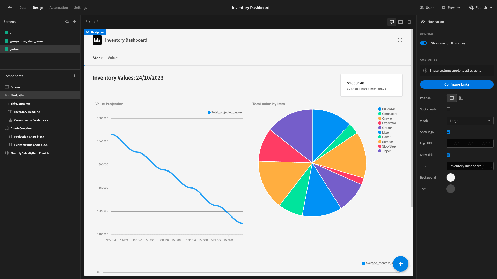
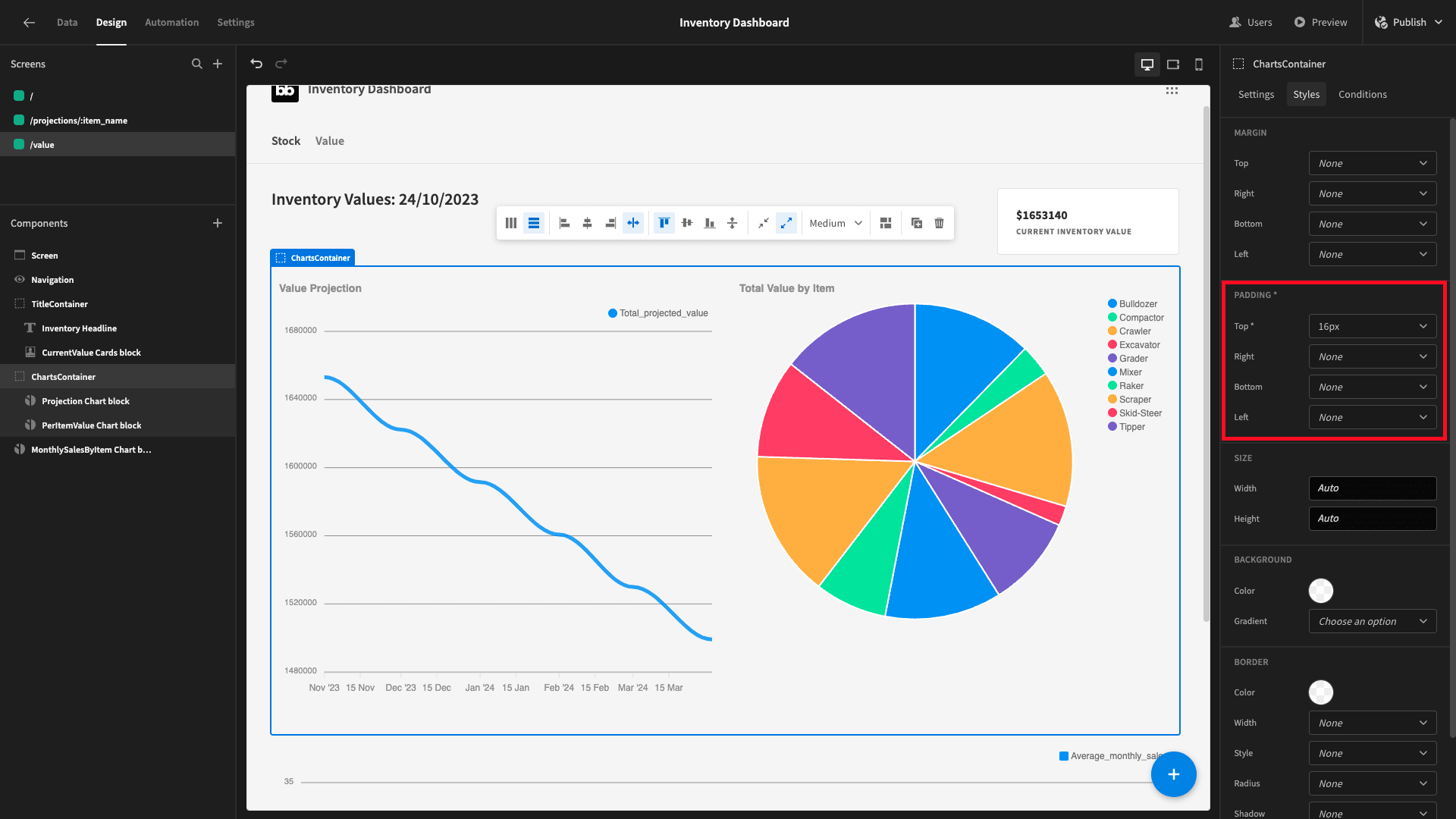
We’ll also add a bit of padding between the two containers on each of our main screens.
And finally, we’ll change the app theme to Nord:
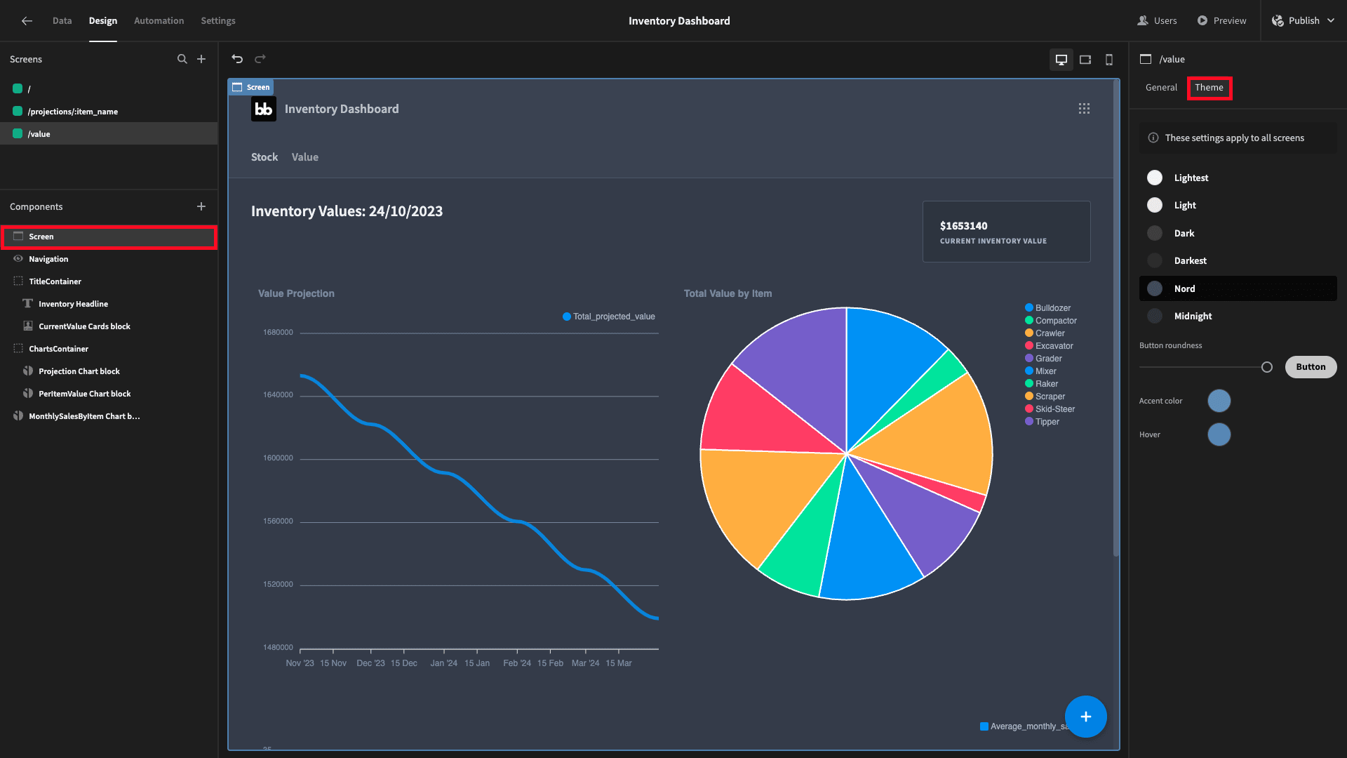
And here’s the finished product:

For another example of how Budibase can help your team turn data into action, why not check out our tutorial on building a logistics dashboard ?